My Role
UX/UI
Year
2021
Duration
5 Months
My Role
UX/UI
Year
2024/25
Duration
1 year
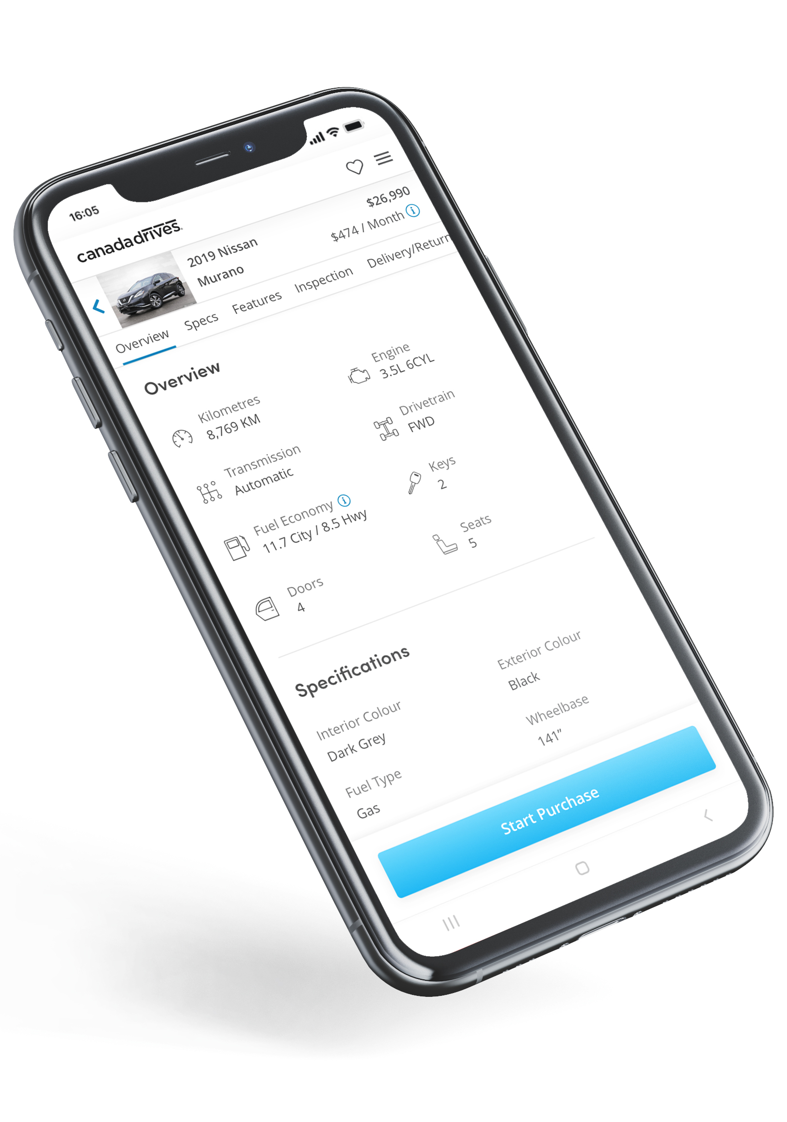
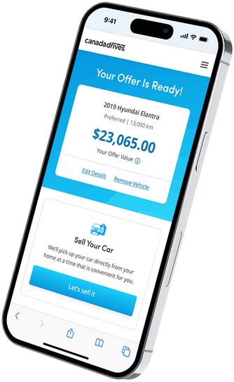
Covid 19 Devastated the automotive indusrty. Car sales were down over 30% and dealerships were closing. Canada Drives needed a way to create cash flow in order to survive as a company.

Covid 19 Devastated the automotive indusrty. Car sales were down over 30% and dealerships were closing. Canada Drives needed a way to create cash flow in order to survive as a company.

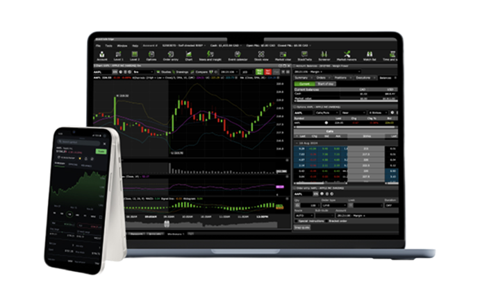
Edge was Questrade’s long-standing active trading platform for serious self-directed traders. It helped establish Questrade as a leading destination for high-volume trading in Canada, running on a reliable back end.
As client expectations and trading volumes grew, it became clear that the next step was not just adding more features but rethinking the experience around speed, insight, and control. Our design exploration for this shift became the foundation for what evolved into Questrade Pro.
Edge still did the job, but the front end showed its age. The UI relied on older patterns and very dense layouts that were harder to scan at a glance. Key tools like charts, options, and order entry often lived in separate views, which meant extra clicks and context switching while the market moved.
Compared to newer platforms, Edge lagged in visual clarity, responsiveness, and workflow efficiency. That gap created a clear mandate to rethink the active trading experience from the ground up.
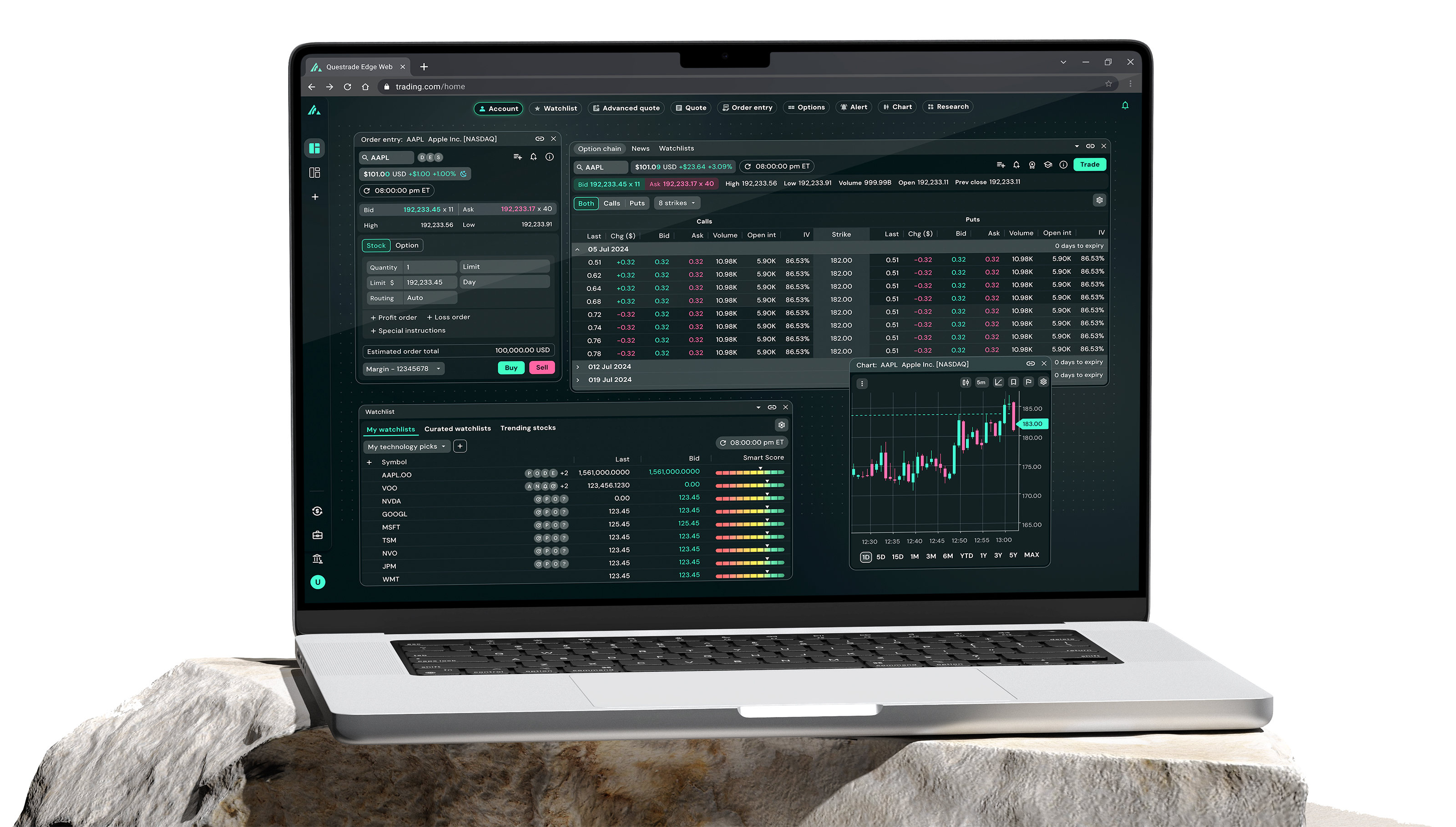
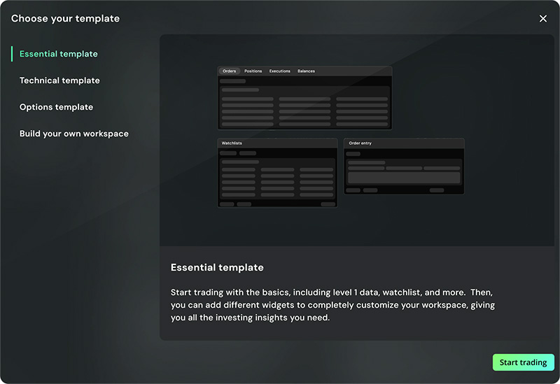
The goal was to build a next-generation browser-based platform that could help active traders work more efficiently. We moved from a single, fixed interface to flexible multi-screen workspaces that behave like an infinite canvas. Charts were rebuilt to be cleaner and more responsive, and the broader UI was redesigned with stronger visual hierarchy so traders can interpret complex data at a glance.
I helped lead the visual and interaction direction so all of this works as one coherent trading experience.


/01
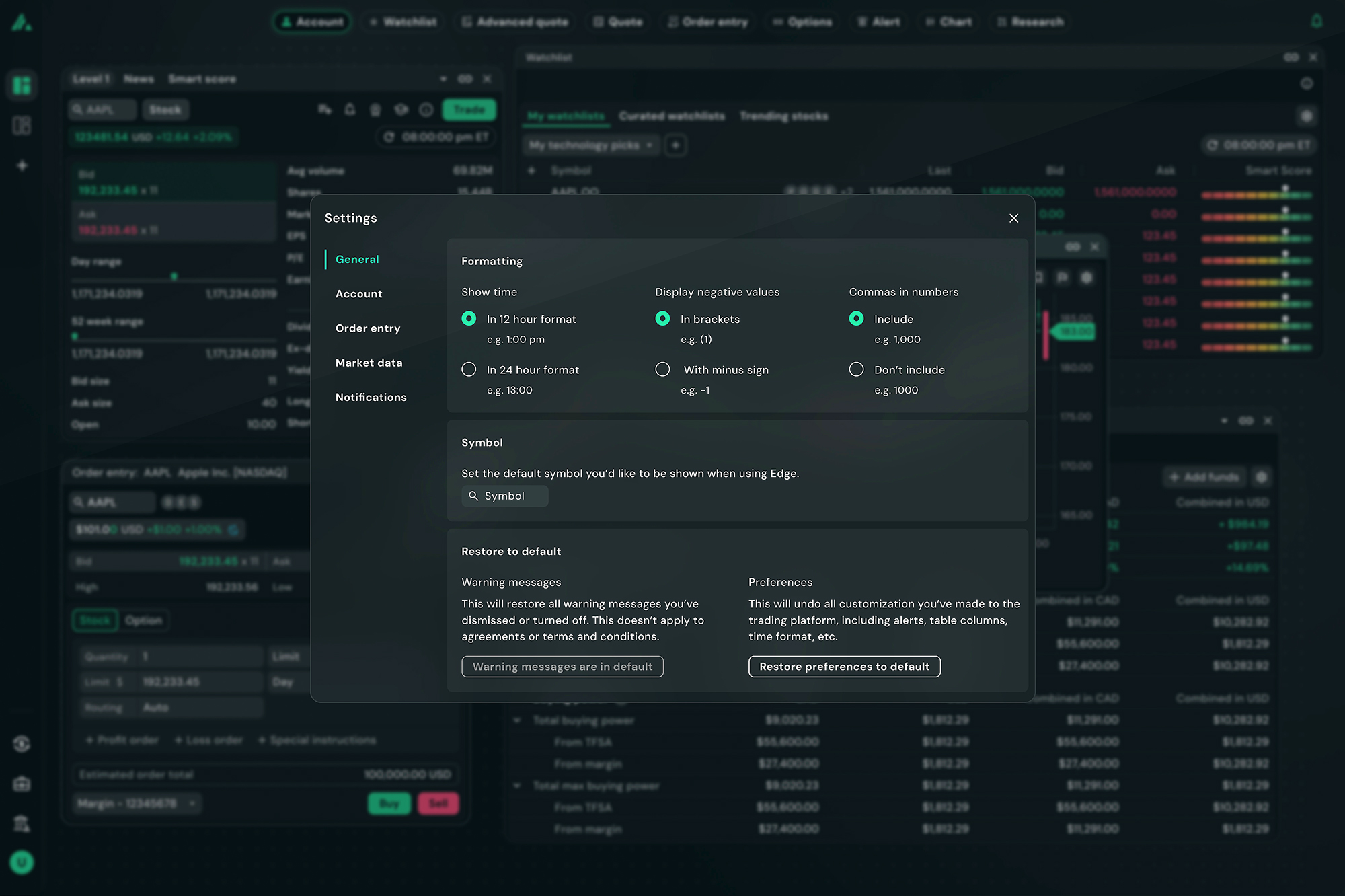
We built the visual foundation around performance. Color, typography, and component rules were defined to support long trading sessions, reduce visual noise, and make dense market data instantly scannable. That set the direction for the UI.
We analyzed modern financial and trading platforms to see how they handle dense data, visual hierarchy, and decision-making speed. We focused on patterns that made charts easier to read, reduced cognitive load, and kept high-value information visible without clutter. This gave us clear benchmarks for usability, contrast, spacing, and overall visual tone.
These insights guided our direction toward a cleaner, more contemporary aesthetic that feels lighter and easier to scan during long trading sessions. We refined color usage, contrast ratios, and typography to support quick interpretation of market data while still keeping Questrade’s green identity front and center.

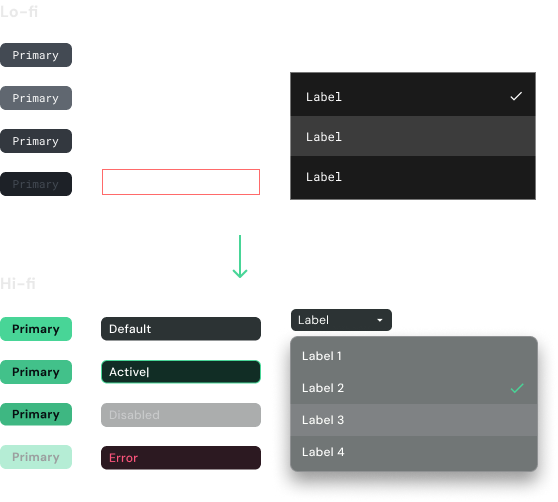
From the start we had limited time for both design and development. To keep dev from sitting idle, we built a set of bare-bones UI components with simple documentation outlining the expected functionality and interactions. This allowed engineering to begin building the core structure and basic functionality early, without needing the final UI.
As the design direction matured, we iterated. We updated the components, refined interaction rules, and delivered stronger documentation. Dev integrated those changes incrementally. This approach kept momentum high and let both teams move in parallel while the visual system continued to evolve.
/02
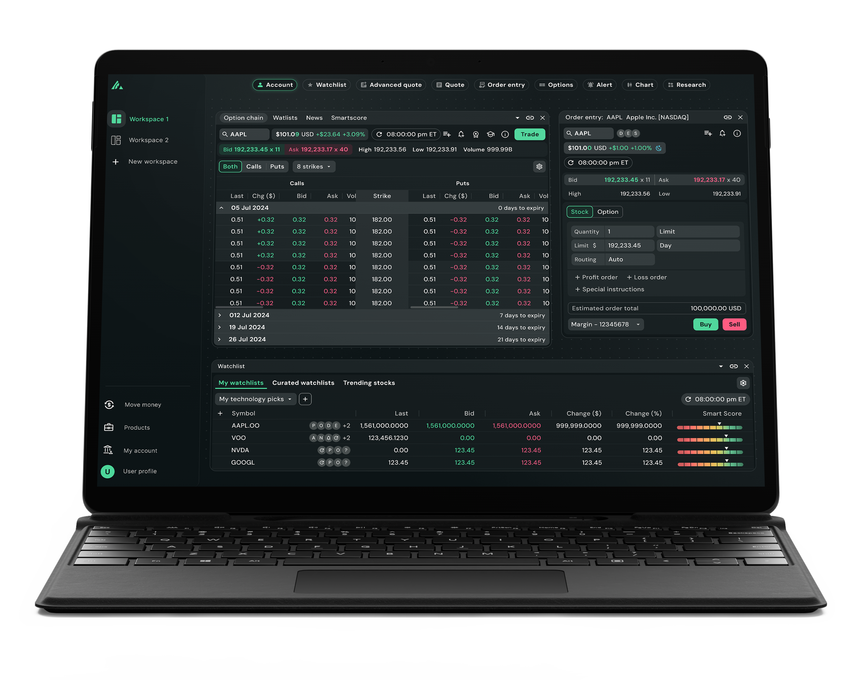
The UI was designed to surface critical data quickly with minimal friction. Traders can parse price action, order flow, and market context at a glance, even during long sessions and volatile conditions.
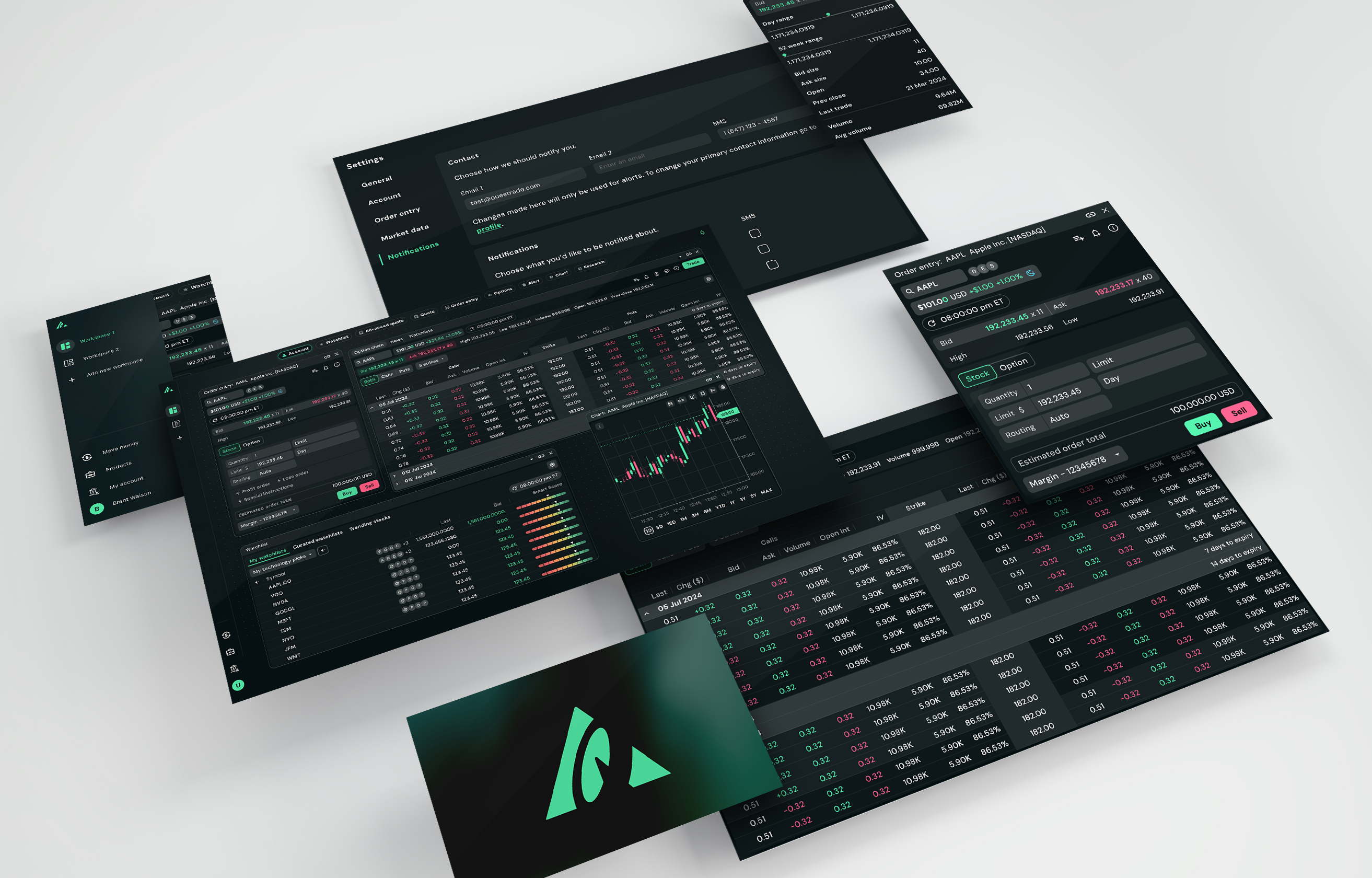
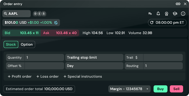
The order entry system was redesigned for speed and simplicity. The real challenge wasn’t the visuals, but the structure. Different order types expose different fields, and the layout has to stay balanced no matter what traders select or what size the window is set to.
Getting that right took work. Every field needed a consistent footprint, had to handle long values, and still collapse cleanly at smaller breakpoints. We set strict sizing rules, ran edge-case tests, and iterated until it worked perfectly.

Watchlists were rebuilt to make scanning quicker and more intentional. Key signals like movement, sentiment, and priority stand out immediately, so traders can spot what matters instantly. The focus was cutting the noise and making it easier to track multiple symbols at once.
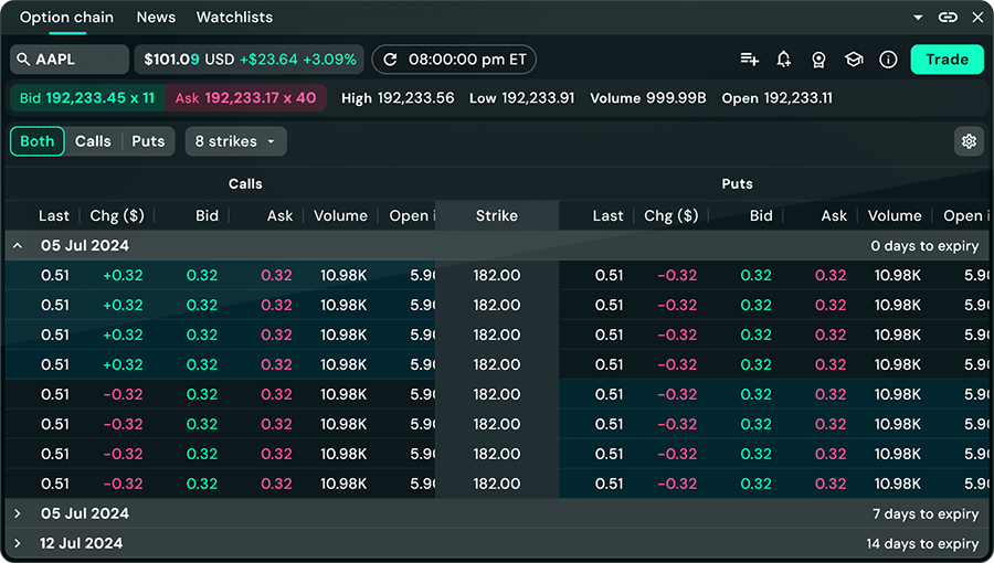
Trader feedback pushed us to make the layout easier to read and compare at a glance. Columns are fully resizable and can be arranged in any order, making the chain flexible enough to match any workflow. You can place single-leg trades or build full multi-leg strategies directly from the chain.
This was also one of the hardest components to design. The chain can show 20+ columns at once, switch between calls, puts, or both, and fall back to smooth horizontal scrolling when space runs out. We tested a ton of edge cases to keep the layout stable, and the final result feels clean and dependable.
/03
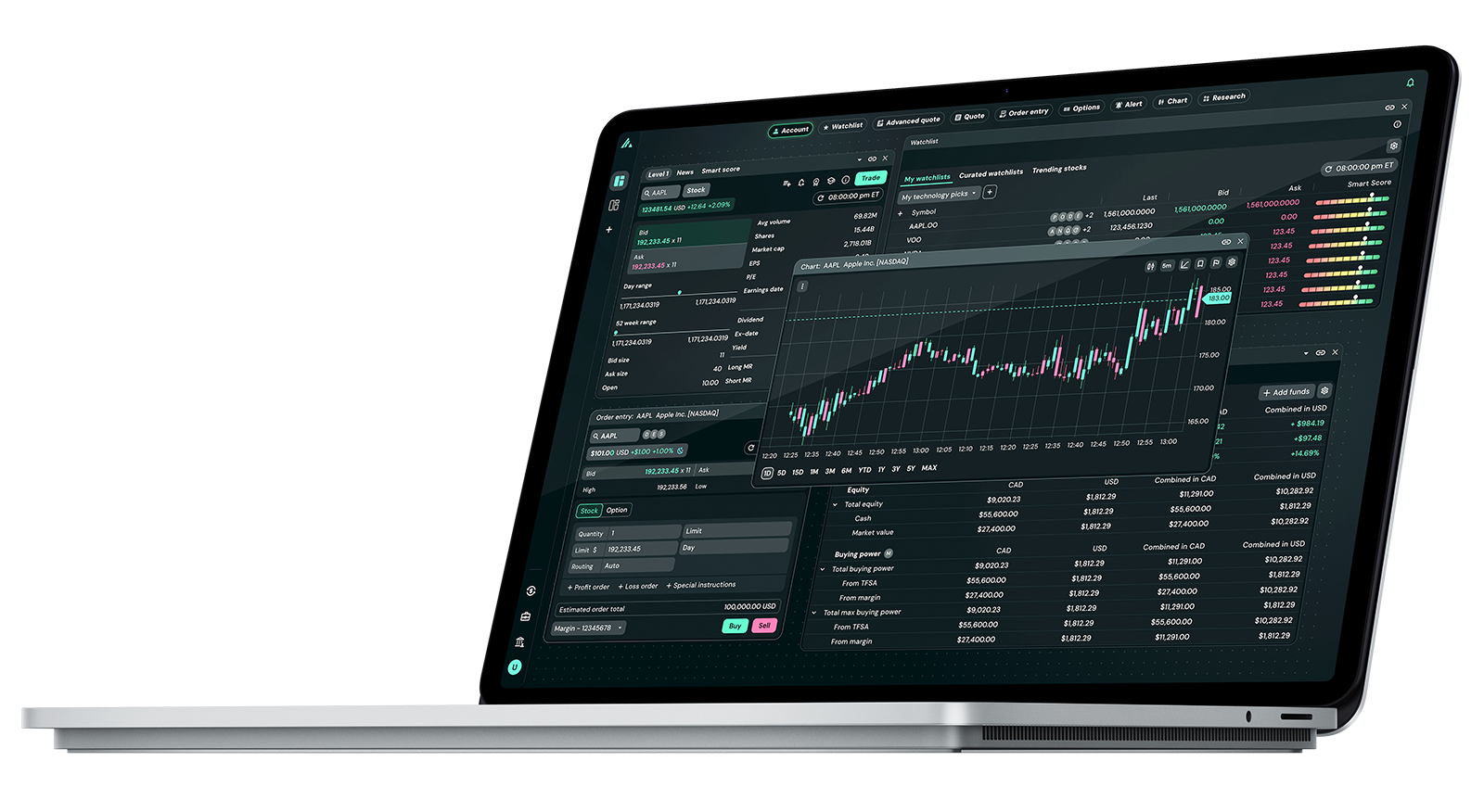
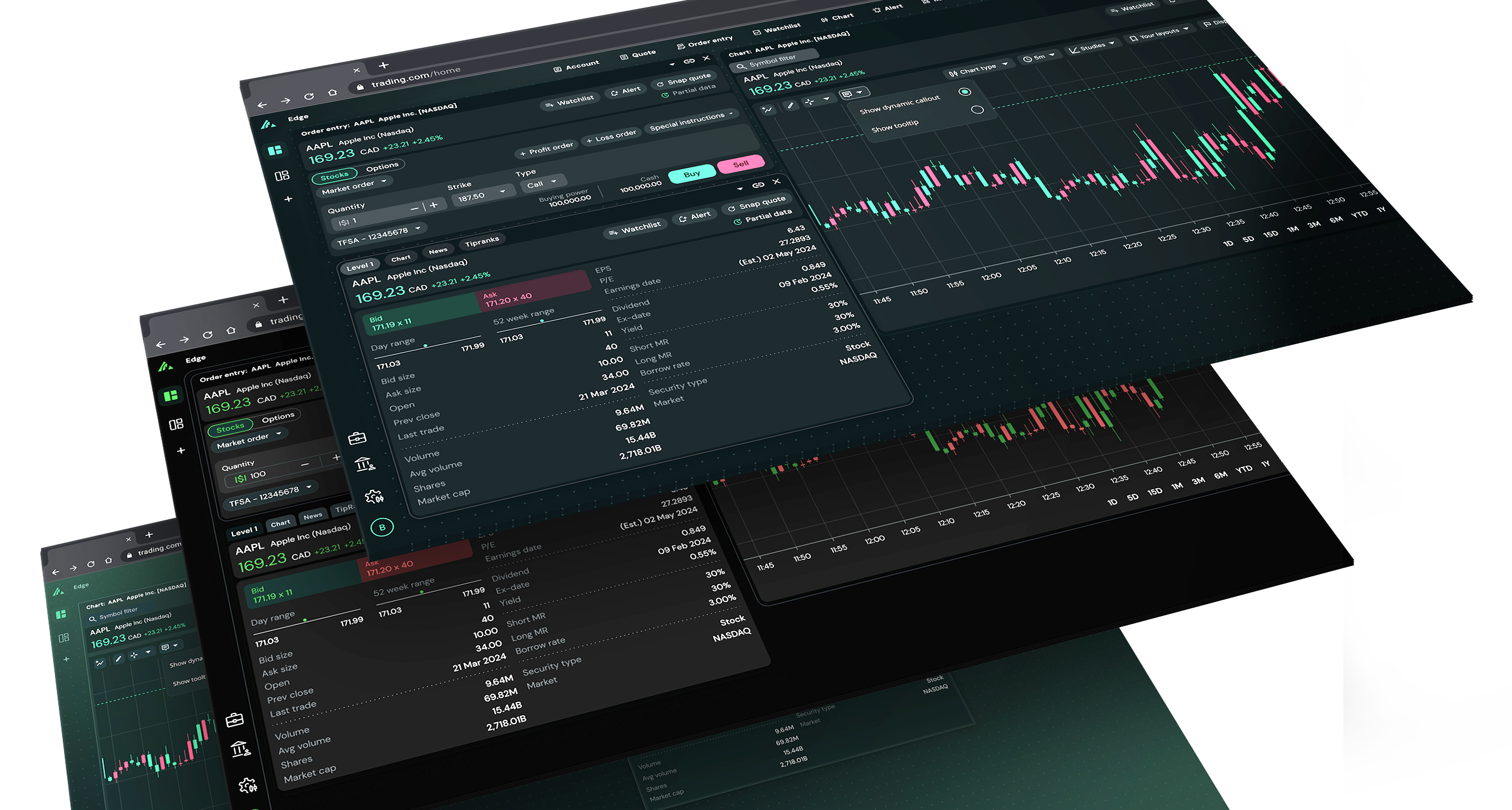
Traders often juggle multiple data sources. Our layout supports smooth transitions between charting, order entry, and analysis without losing context. This reduces cognitive load and speeds up execution.
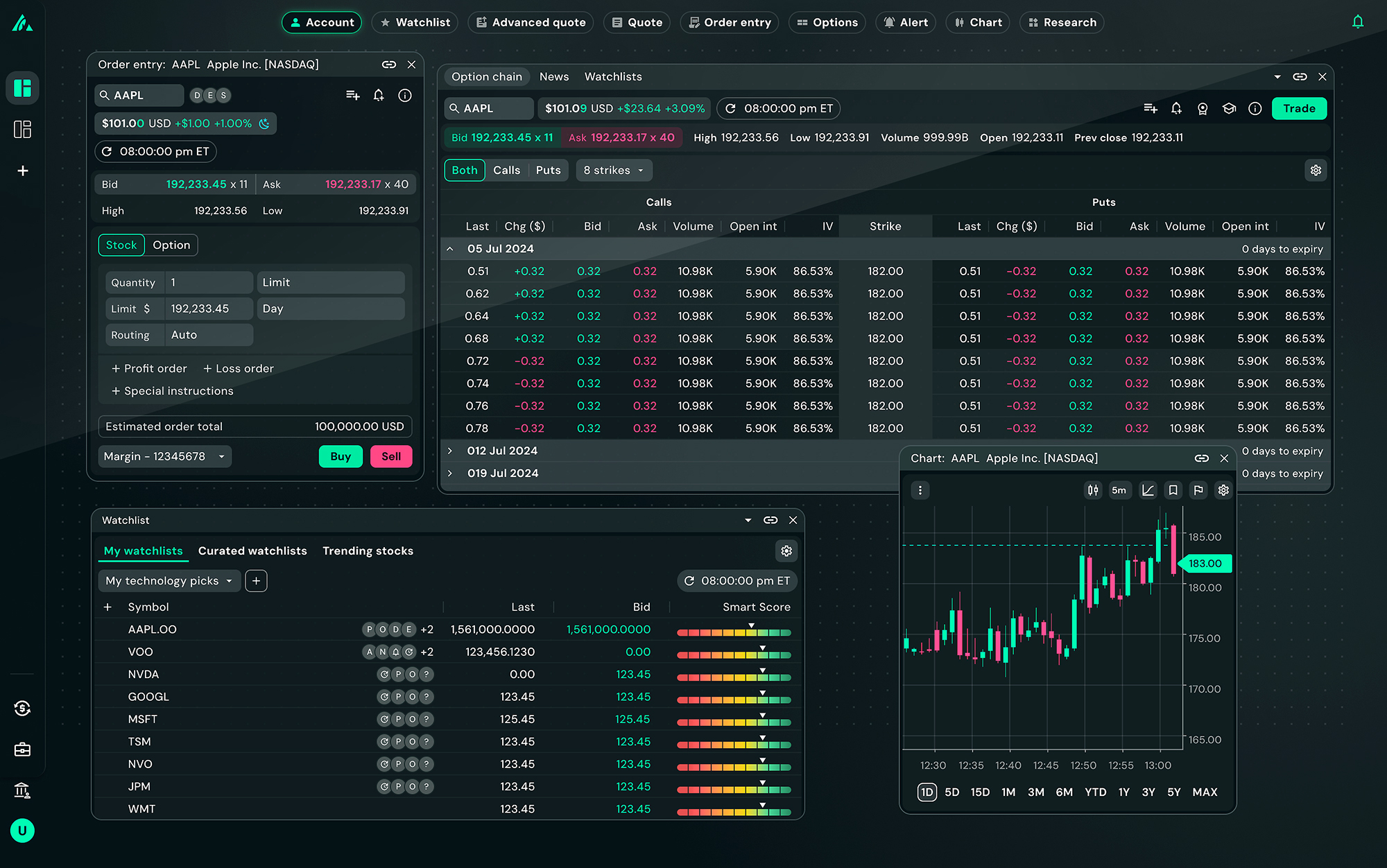
We made widgets fully resizable because traders all work differently. Some use one laptop, while others spread panels across three monitors so we wanted to provide extra flexability. Everything scales cleanly at any dimension, no snapping or forced breakpoints.


Linking widgets together is a simple yet powerful feature that significantly streamlines your workflow. By linking your watchlist to your order entry screen, clicking a stock symbol in one instantly updates the other, saving valuable time and reducing manual entry. This seamless connection of information is crucial for quickly acting on market opportunities.
Active traders rarely work from a single layout. Pro lets them create and switch between up to five fully separate workspaces. You can start from templates or build your own, rename them, and customize each one however you want. It makes it easy to jump between different trading modes without rebuilding your setup every time.
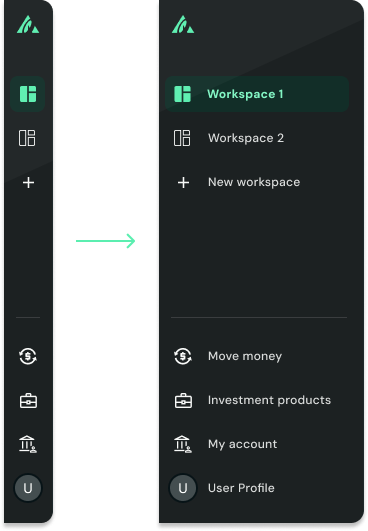
The sidebar expands when you need more detail and collapses when you don’t. You get full labels for workspaces, settings, and tools without permanently giving up screen space. The expanded state sits on top of your layout instead of pushing it around, so you keep maximum room for charts and data while still navigating fast.
Click to watch demo


Our goal was to create a platform that meaningfully improves the trading experience for active investors. The new design enables a flexible multi-pane layout, clearer data interpretation, and more intuitive order execution. Traders can seamlessly build and switch personalized workspaces to match how they actually trade.
While performance metrics are still being collected, early signals show stronger usability, clarity, and control. More importantly, this work establishes the architectural and interaction foundations for Questrade’s next-generation trading vision, aligning the platform with their broader goal of enabling active traders to operate with greater speed, confidence, and efficiency.

Melanie
UI Lead

Lia
UI

Brent
UX/UI

Andrew
UX

Carleen
UX

Aisana
UX/UI