Club Jibarito (ORO Freeport) has set the standards of luxury retail in Puerto Rico and the Caribbean. Today, they are one of the select stores worldwide to offer such a wide array of elite brands. The company has a long history being an independent family business, where the next generation is looking to modernize the brand image and how they deliver their products. We were tasked to create an entire e-commerce platform and a complete brand redesign.
We started off the project by conducting a competitor analysis to get familiar with the world of e-commerce. This consisted of both direct and indirect competitors. We wrote down some of the major strengths and weaknesses of each of the websites which helped us determine the most commonly sought-after features and gave us insight on the latests design trends in fashion & luxury e-commerce.
In order to empathize and understand the target users, we need to find out exactly who they are a what the typical e-commerce concerns are amongst a broader population. To achieve this we sent out surveys and conducted several interviews with users who are familiar with online shopping to identify their needs and pain points. Because a wide range of demographics enjoys online shopping, we interviewed a total of ten participants between ages 20 and 65. We found that convenience was huge key reason for consumers to shop online. However a common pain point that was brought up was the fact that the product might not fit due to not being able to try it on before purchasing.

With the research conducted thus far and the findings from the user interviews, we were able to figure out what will be created, for whom, and how. Based on the insight provided the participants during the user interviews, we created a persona that reflects various needs and pain points and an empathy map to delve further into behaviours, attitudes, and thoughts of the persona. This helped us bring the persona to life and examine the problems more carefully from the user’s perspective.

Now that we had our user persona we took a step back to get a clear overview of both the business and user goals. We would refer back to this throughout the entire design process to keep us on track and remind us who we are designing for.

The goals of the UX design phase were to introduce methods to to secure a solid foundation for brand-related communication. We applied our findings from our research to come up with an intuitive, functional UX design that would satisfy all type of customers. We designed with an emphasis on the quality of the products, unique brand essence, and a seamless user experience. With this we were able to come up with a simple, yet intuitive framework complete with a customer account, detailed product pages, suggestions for similar products, and simple & secure checkout. Below are some lower fidelity mockups showcasing some of our earlier ideas.
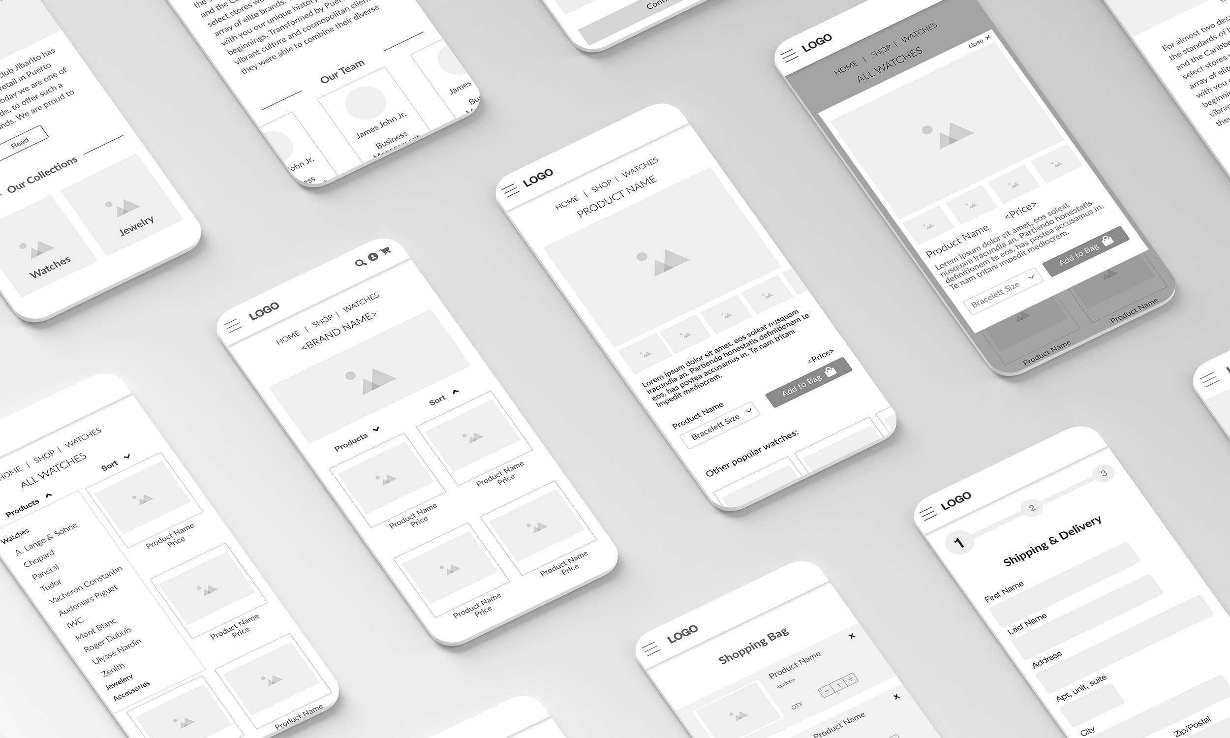
First-time users mostly judge the site and brand by the first impression, and tend to stick to that initial feeling throughout their shopping session. Since this is a high-end luxury e-commerce website we went with a clean, elegant look with lots of high-class imagery. To achieve this we avoided following any highly stylized design trends, resulting in a clean, minimalistic design that maintains a professional look and feel throughout the entire site.

Testing & Iterations.
Test participants pointed out that it would be nice to have the ability to edit the product quantity and size in the shopping cart. In our original designs that user would have to remove the product and add it again. Implementing quick edit settings makes it easier for the user to make last minute changes before proceeding to checkout.

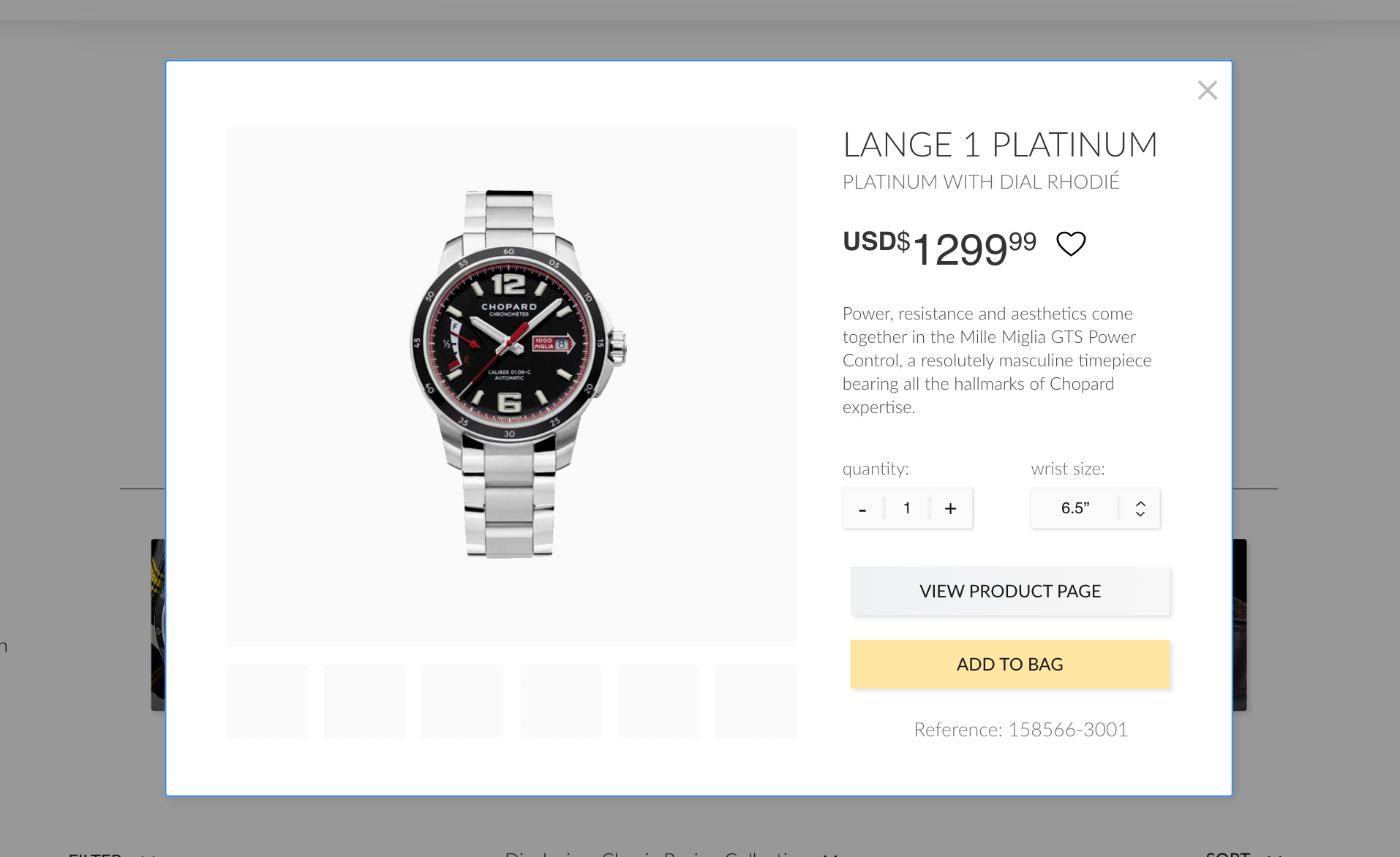
One common feature that we overlooked in our initial designs was implementing a quick view pop-up so the user can get some general information about the product without having to load the product page. This allows the user to more easily navigate through the search results and find what they are looking for much quicker.
Some participants expressed that the sort button was difficult to find and should be more prominent. Many users find the sort button to be a very useful feature so we too a deeper dive into what some of the larger e-commerce platforms are doing and we found the common trend is to keep it separate from the rest of the filters. So we removed it from the filter dropdown and a new menu specifically for sort option.

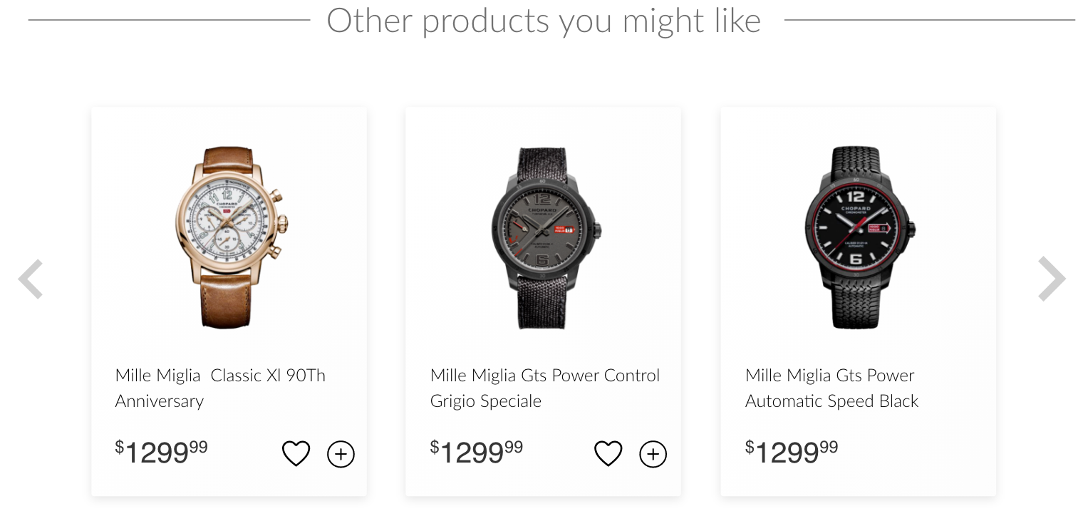
A product recommendation algorithm can help shoppers find products they're interested in, and by showing relevant products to shoppers, it can improve the chances that they'll make a purchase. After several iterations we decided to include a carousel on multiple pages, not only the product page, and include a recently viewed vehicle carousel as well.
The Final Product.
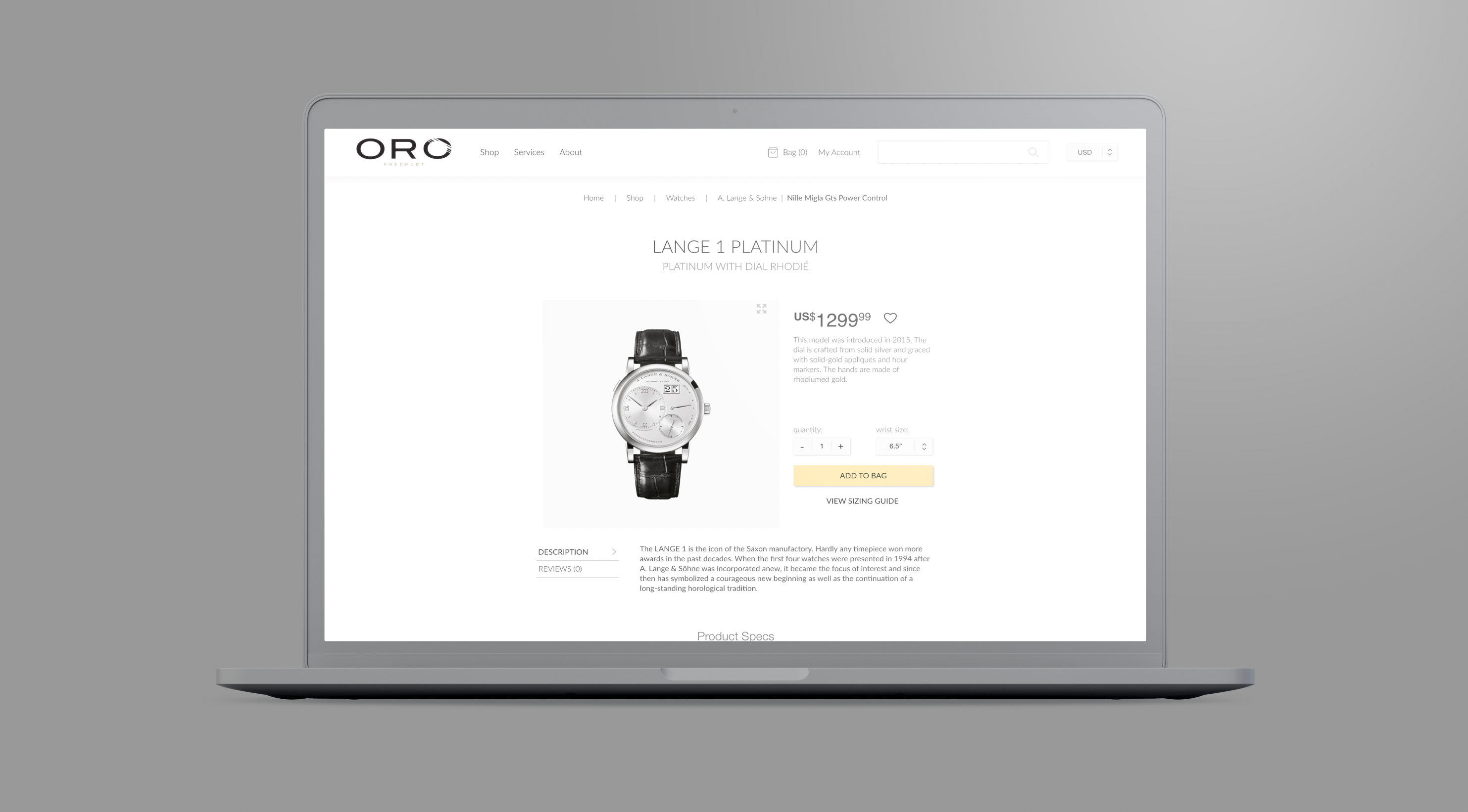
In luxury e-commerce, photos make or break the sale as it's generally the only way they can interact with the product. It might be the only image of it they see and it's easy for the default image to turn a customer away. Our solution was to make sure that the first product image has rich visual details that highlight its features and represents the product accurately. If we fail to do so, the user may abandon an otherwise suitable product. With that said, it's important that every image is high-resolution with the option to zoom in to inspect all the fine little the details.

It's important to make sure product descriptions as detailed as possible. When users don’t see certain information about a product, it implies that the product doesn’t have such a feature or attribute, so it's good practice to make sure product pages always have adequate information highlighting key features and listing product specs. We also included additional information such as a sizing guides so customers can be confident that their product will be the right fit.
Clicking through to the checkout is the moment when customers weigh up whether they are happy with their decision, or if they are still in any doubt. It's important to remove nuisances or distractions on their way to pay for the item so we designed it to be completed in 3 simple steps. Sometimes users use their cart to compare and store products, but it may be difficult to review items in the cart if it is not optimized to facilitate comparison. We implemented this functionality into our designs featuring large thumbnails, key product details, a link back to the product page, and the ability to quickly adjust product size & quantity.

We designed a simple, yet extremely functional and secure checkout process that maintains the same elegant look and feel of the rest of the website. The process has only 3 steps and showcases a progress bar at the top of the page that lets the user know how far along they are. In addition to this, user have the choice to pay by credit card, PayPal, or even crypto currency. Puerto Rico has earned a reputation as a hub for crypto currency enthusiasts so it was important to the client that we implement this functionality to give users more freedom to pay how they like.


This was my first time working on an e-commerce project and as a lead designer. It was very challenging but it became an invaluable learning experience that taught me a lot of important skills that every UX designer needs. It was a great introduction into how psychology and UX design can work hand-in-hand together to help solve contemporary problems for businesses. I have also been introduced to the typical practices of e-commerce sites through understanding the expectations of the clients and research to empathize with the users in terms of what they look for in a good design solution.
By incorporating the design approach, I was able to empathize, define, ideate, prototype, and test. Through this particular process, I was able to understand the ways in which each of the steps could be used to help develop the final product.
Up until this project I hadn't had a lot of experience with user testing. Throughout this project I found the user interviews to be quite helpful as they provided insight that I originally did not think of. Doing so taught me the importance of testing and is something I would like to do more of in future projects.
In addition to that, I learned the importance of empathizing with the user. Not only does it allow me to better understand the needs and pain points of the user, but it also enables me to address the problem in a human-centred manner.