My Role
UX Lead
Year
2022
Duration
2 Months
Despite the steady increase in vehicle sales, we acknowledged several challenges posed by the original product page. Consequently, we embarked on a comprehensive overhaul to address usability issues, increase conversion rates, and fix the absence of crucial functions.
The goal of this project was to create a new product page that would be visually appealing, highly functional, and easier to maintain. By prioritizing user-friendliness and optimizing the customer journey, we sought to enhance trust and improve the overall online experience.
Read on to see the complete design process and the positive impact it had on the company...


/01
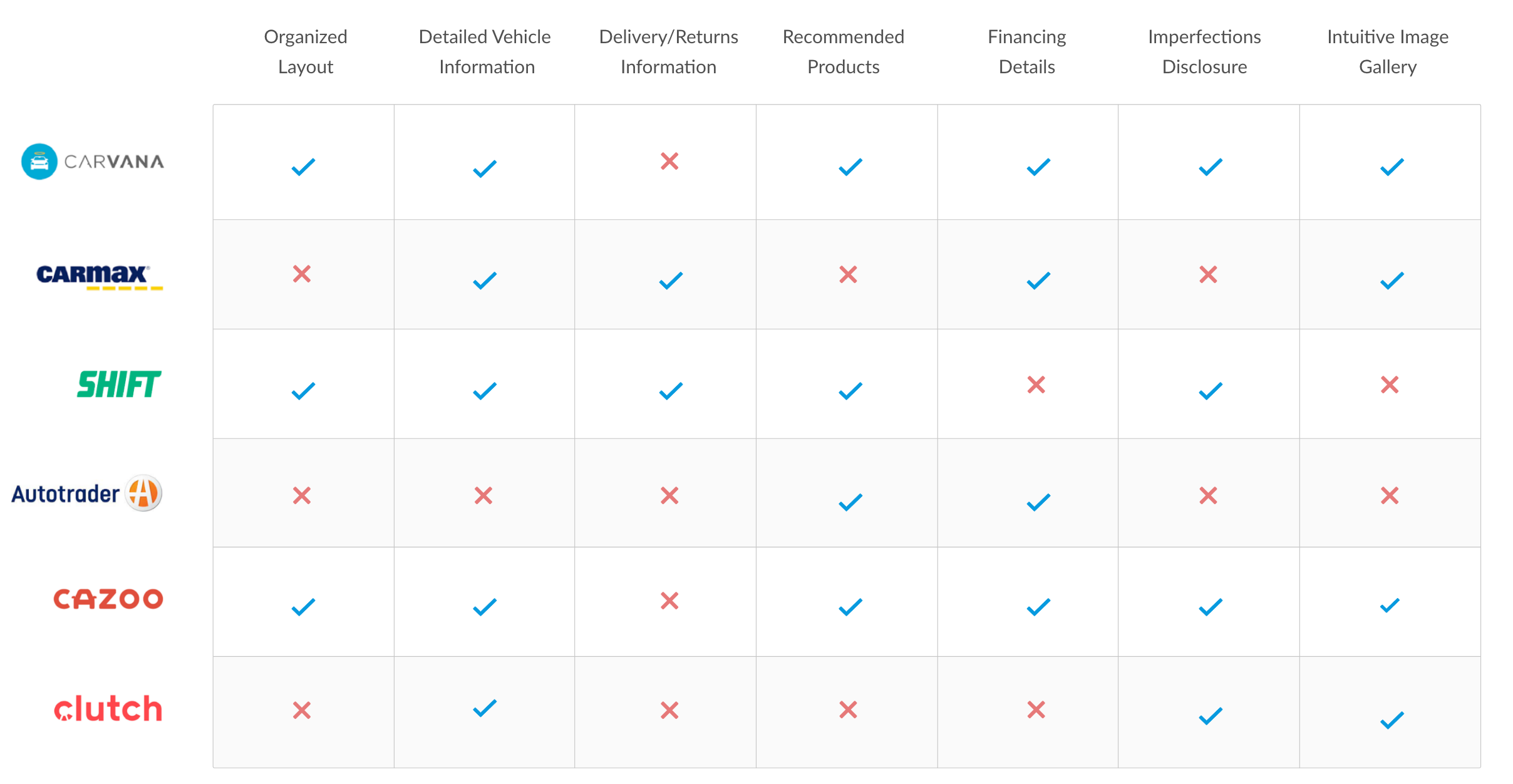
We initiated our project by conducting a comprehensive competitive analysis as it provided us with valuable insights into the existing market landscape, competitors' offerings, and emerging trends. This method was chosen to inform our strategy, identify opportunities for differentiation, and ensure that our product would stand out among competitors. The analysis proved effective in guiding our decision-making process and shaping our approach to create a unique and compelling offering.
/02
Following our competitive analysis, we conducted a comprehensive heuristic evaluation of the original page design. This approach provided valuable insights into the areas where the page was lacking, enabling us to make informed decisions on how to enhance it. The effectiveness of this process stemmed from its ability to pinpoint specific areas of improvement, facilitating our efforts to create a more user-friendly product page.
Some key findings from our heuristic evaluation include:
The vehicle features list is too long, making it difficult to read and causing excessive scrolling.
Tabs hide important information, rendering them ineffective in this context
There is no way to enlarge or zoom in on gallery images.
The use of language and technical terms is unclear in some areas.
Lacking features and overall intuitiveness, adversely impacting the user experience
/03
We recognized the importance of understanding our customers' firsthand experiences with our product, which led us to choose surveys and interviews as valuable research methods. By directly engaging with our customers, we gained insights into their specific pain points, preferences, and suggestions, enabling us to make informed decisions for product improvements. This approach helped us align our product more closely with customer needs, resulting in enhanced user satisfaction and a stronger product-market fit.
Some of the questions we asked include:
Can users quickly & easily find what they are looking for?
Is there enough information provided to confidently make a purchase?
Are there any specific features missing that customers would like to see?
Is the language clear and easily understood by users?
How does our product page compare to similar services?
What are the biggest concerns around making large online purchases?

"It would be nice to be able to zoom in on gallery images."

"I value transparency so more detailed info about warranties and the delivery/return process would be helpful."

"I want to see features that help me make a more informed buying decision."
About 65% of users expressed hesitation around buying cars online, particularly if they feel that they don't have enough information or transparency about the product and purchase process.
Around 40% of users noted that the inability to zoom in on images made it difficult for them to visualize the appearance of the vehicle.
35% of participants reported having difficulty finding the information they needed. Specifically, many mentioned about the inclusion of features that help simplify the process of finding a car.
/04
User personas were chosen to foster a deeper understanding of our target audience, their goals, and behaviors, guiding our decision-making process. These personas allowed us to empathize with users, gain valuable insights into their needs, and make informed design and development choices tailored to their specific requirements. By incorporating user personas, we ensured a user-centered approach that resulted in a more targeted and effective product.

Age: 25
Work: Web Developer
Family: Single
Joshua is a first time car buyer. He values transparency and expects to find all the information he needs to make an informed decision on the website. He is a busy individuals with a fast-paced lifestyle, and wants to be able to quickly and easily find the information he needs without having to spend a lot of time searching for hidden information.
• User-friendly platform with transparent info on car buying process
• To be able to see detailed vehicle specs, pricing, financing
• First time car-buyer, unfamiliar with car buying processes
• Frustration with websites that have unclear or incomplete information

Age: 36
Work: Photographer
Family: Married, 2 children
Emily appreciates being able to see detailed images of the vehicles she is interested in. She values clear and concise language and is easily confused by industry jargon and technical terms. She has a busy lifestyle and prefers the convenience of online shopping over visiting physical dealerships.
• Wants to see high-quality images and visual content
• Prefers simple language to explain vehicle details
• Feeling overwhelmed or confused by technical terms
• Frustration with the inconvenience of visiting physical dealerships
/04
We then chose to use a Venn diagram as a visual tool to bridge the user goals and business goals of our project. This approach was effective in illustrating the overlapping areas where both user needs and business objectives could be addressed. The Venn diagram helped align our decision-making process by identifying opportunities for win-win scenarios, ensuring that our product would meet user needs while also supporting the strategic goals of the business.
/05
Having collected all the research insights, we gained a much clearer vision for the project. By aligning the business goals with the needs of our users, we maintained a strong focus on the following categories:

Trust and transparency are crucial otherwise customers may feel unsure about making a purchase and have a negative experience. Prioritizing trust and transparency helps build credibility, foster long-term customer relationships, and increase overall customer satisfaction.

We understood that adding more information to the page would significantly impact its layout and structure. Therefore, we prioritized the organization and presentation of the content to ensure a seamless and intuitive user experience. As such, we invested significant effort in creating a user-friendly layout that presents information in a clear and structured way, allowing users to easily navigate and effortlessly find the information they need.

Our feature-focused approach in designing the product details page for selling cars online aims to drive user engagement. By integrating engaging features such as interactive image galleries, a finance calculator, visual guides, and personalized suggestions, we strive to create an immersive and informative experience for potential buyers. These carefully crafted features empower users to explore, compare, and make informed decisions, enhancing their overall engagement and increasing the likelihood of successful car purchases through our platform.
/06
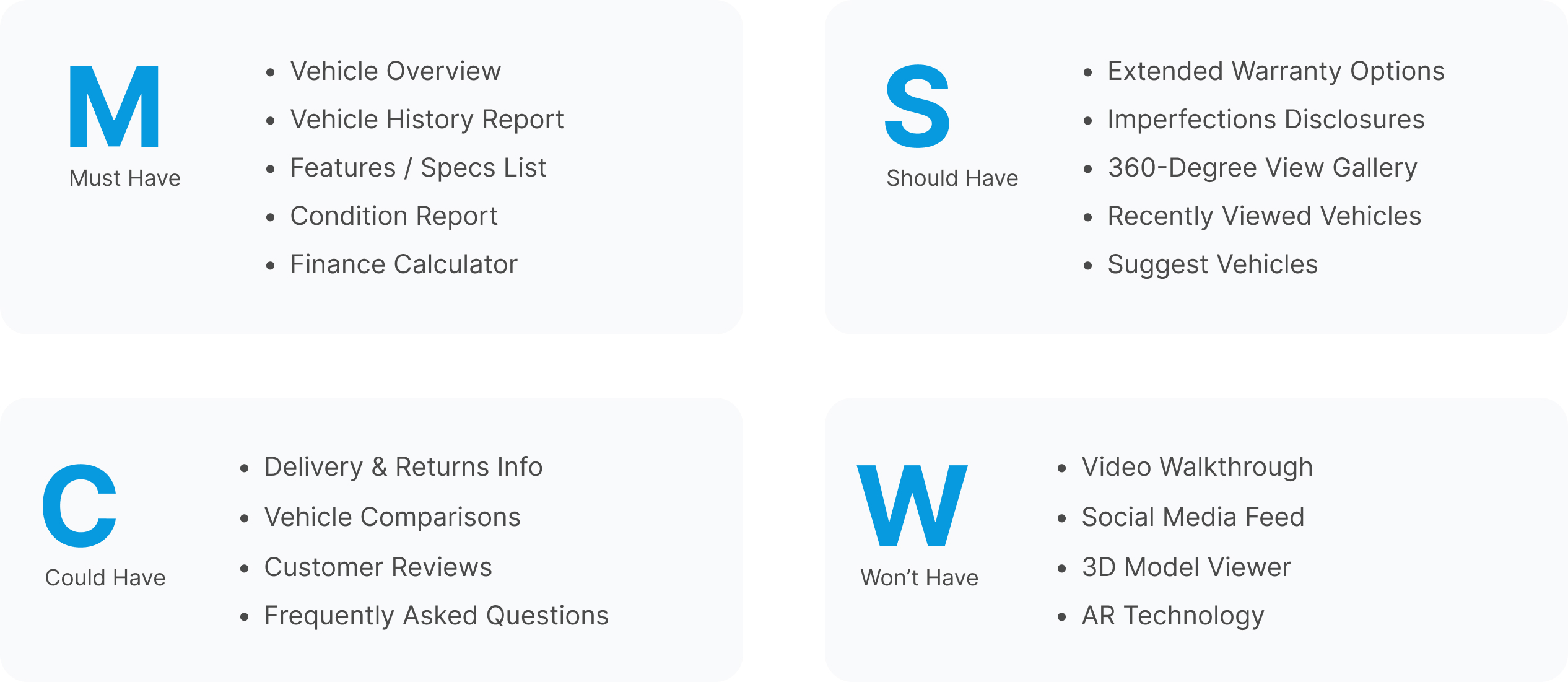
We utilized a MOSCOW chart to determine the features and information that should be included on the page. This process aided us in identifying our priorities based on our competitive analysis, user feedback, and business goals. Once we finalized the items we wanted to incorporate, we conducted card sorting tasks to establish their hierarchy on the page.
/07
Next up was deciding on the layout. Since the page had a lot of content, we needed to make sure it was easy to navigate and didn't overwhelm the user. We aimed to create a smart layout that would break down the information into manageable chunks and present it in an organized manner.
Starting with sketches allowed us to brainstorm different ideas and design effective screens. Below are some of the final sketches that we used as a basis before digitizing our wireframes.

/08
We created grayscale wireframes as a blueprint for the visual interface and as a basis for our prototype. The grayscale wireframes allowed us to test the effectiveness of the hierarchy, priority, and flow of the design before implementing more details such as fonts and colors. This approach ensured that the design met our goals and the user's needs while minimizing the need for costly changes later in the process.

/09
After establishing the layout for our redesign, it was time to add some visual flair to really make it pop. Since we were dealing with a lot of content, we knew that we had to be careful not to overload the design with too many distracting elements. Instead, we opted for a clean and minimalistic look that still stayed true to the brand. By incorporating a careful balance of colours and imagery we were able to come up with a design that felt both professional and visually engaging.

/10
When designing the vehicle page, we were intentional about using the existing typography and colour palette that had already been established. We recognized the importance of consistency in maintaining brand recognition and enhancing user experience, so we made a conscious effort to align the typography and colour choices on the webpage with the rest of the website.
Ensuring adherence to WCAG AA standards was also equally important. By complying with these standards, we ensure that our website is inclusive and provides equal access to individuals who may have visual challenges.
.jpg)
/11
We selected qualitative testing to gain deep insights into the user experience, uncover usability issues, and understand user perspectives. Userlytics served as our preferred platform, providing intuitive remote testing capabilities with reliable user recruitment and seamless video recording and analysis. This combination proved invaluable in obtaining actionable feedback, informing design decisions, and enhancing the overall user experience.
Keep reading to see several examples that underwent significant changes throughout the process, and the solutions we came up with in the end...
/12
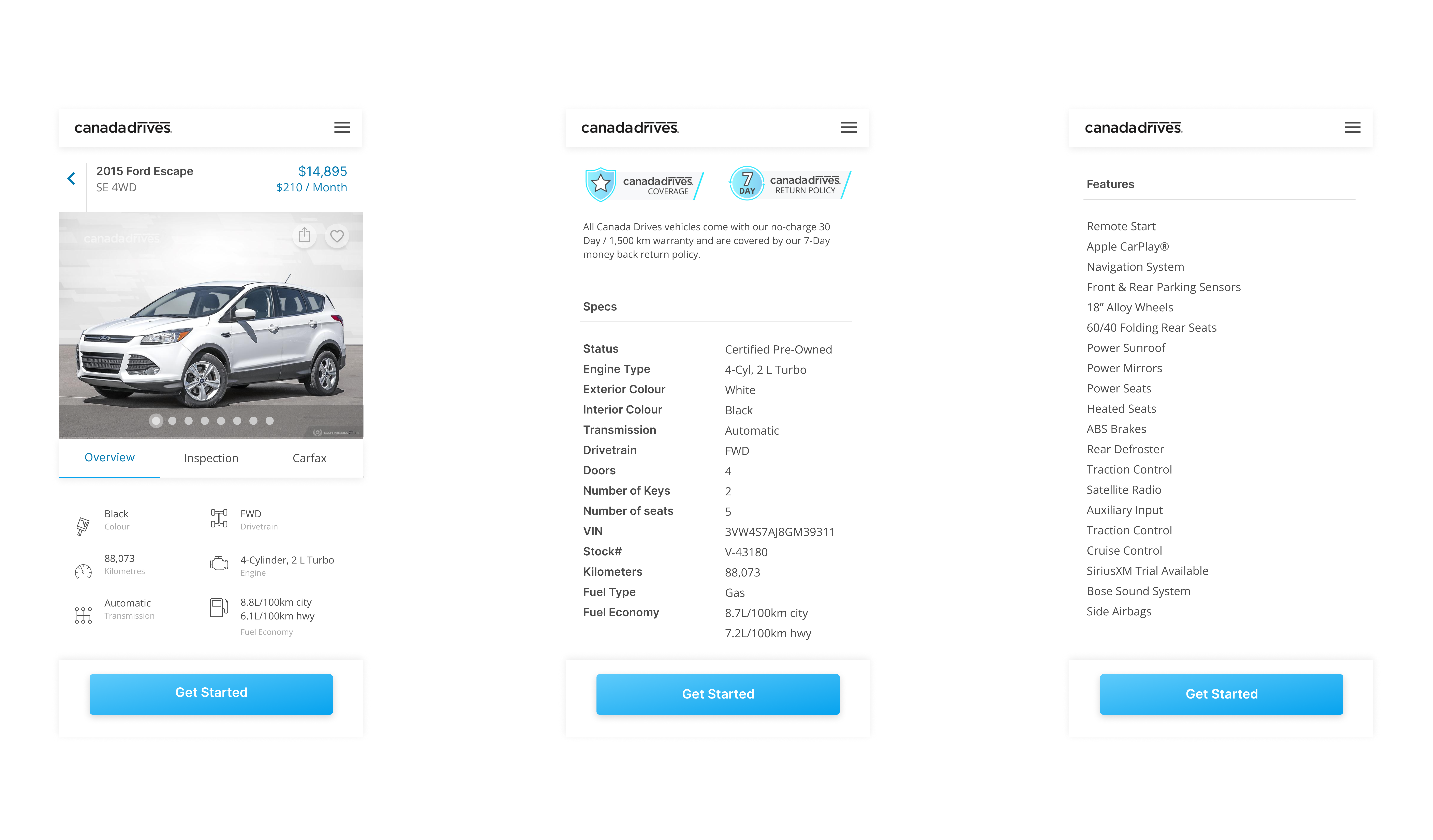
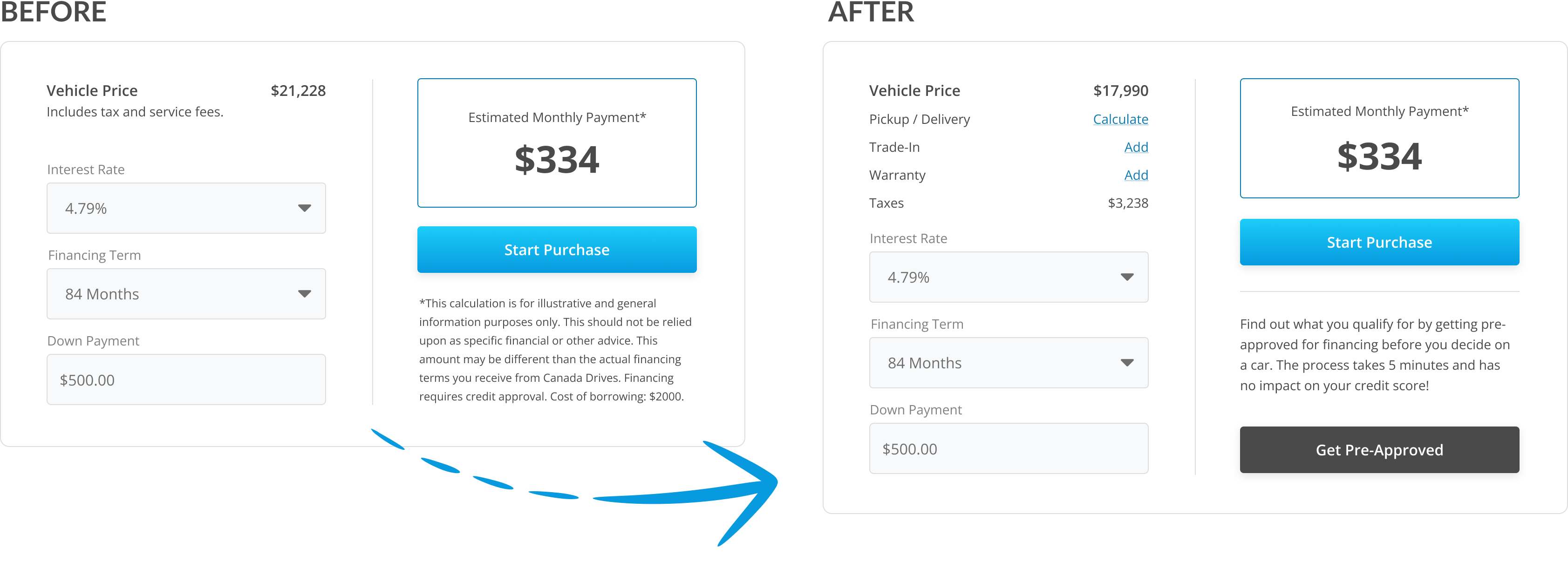
The Finance Calculator gives customers a quick estimate of their monthly payments. The initial problem was that the calculations were based on vehicle list price and didn't take into account any other options that that could impact the price. For more accurate estimations, we included options to factor in the delivery fee, calculate extended warranty costs, and deduct the trade-in value (if applicable).
We also introduced the Pre-Approval button to this section as well, bringing more attention to the pre-approval process and and to increase the amount of finance applications submitted.
/13
Based on user feedback, we added a feature to highlight popular vehicle features on the page, which helps users quickly determine if the vehicle is suitable for them. We conducted surveys and a competitor analysis to identify the most desirable features that customers look for when buying a car and tested several different ideas for placement.
Ultimately we decided to place the feature at the top of the page for easy access. This became a valuable addition which increased user engagement.

/14
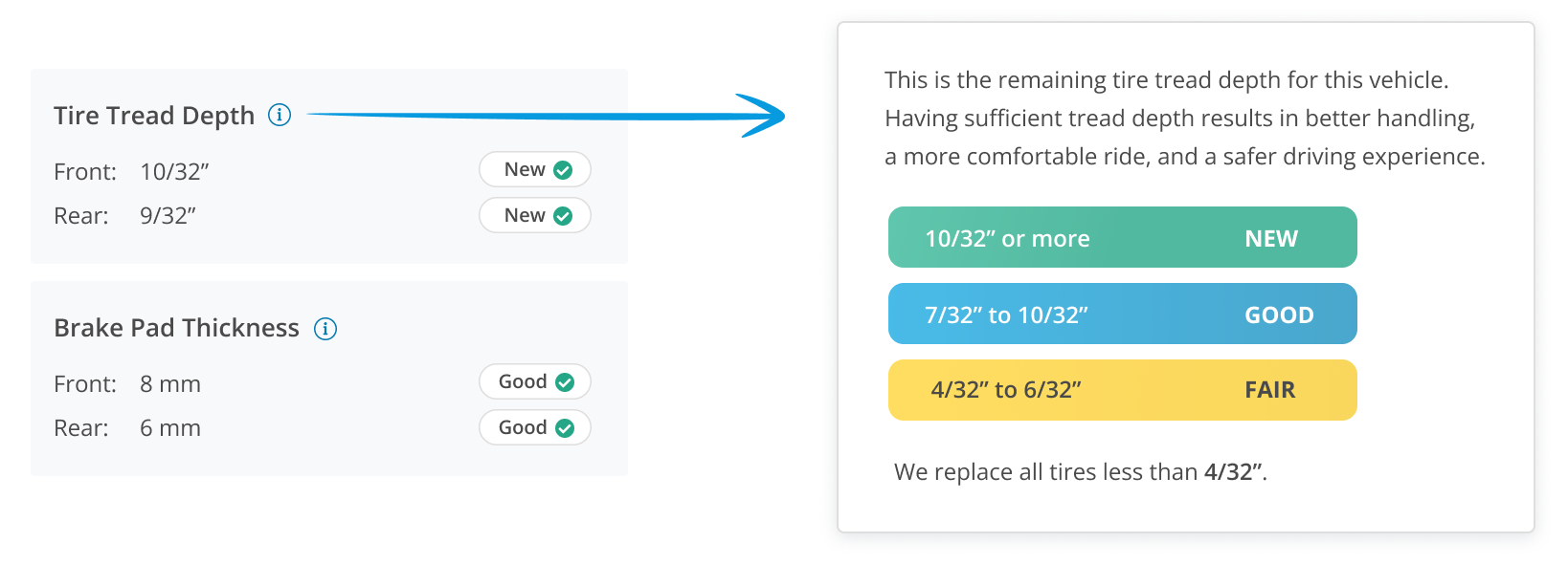
We recognized the importance of informing customers about the condition of a vehicle's tires and brakes, as it can greatly impact their buying decision. However, during testing, we discovered that some users were unclear about how to interpret these measurements.
To address this, we created a tool-tip guide that illustrates how to read the measurements and explains the importance of it. This has proven to be beneficial, particularly for first-time car buyers.
/15
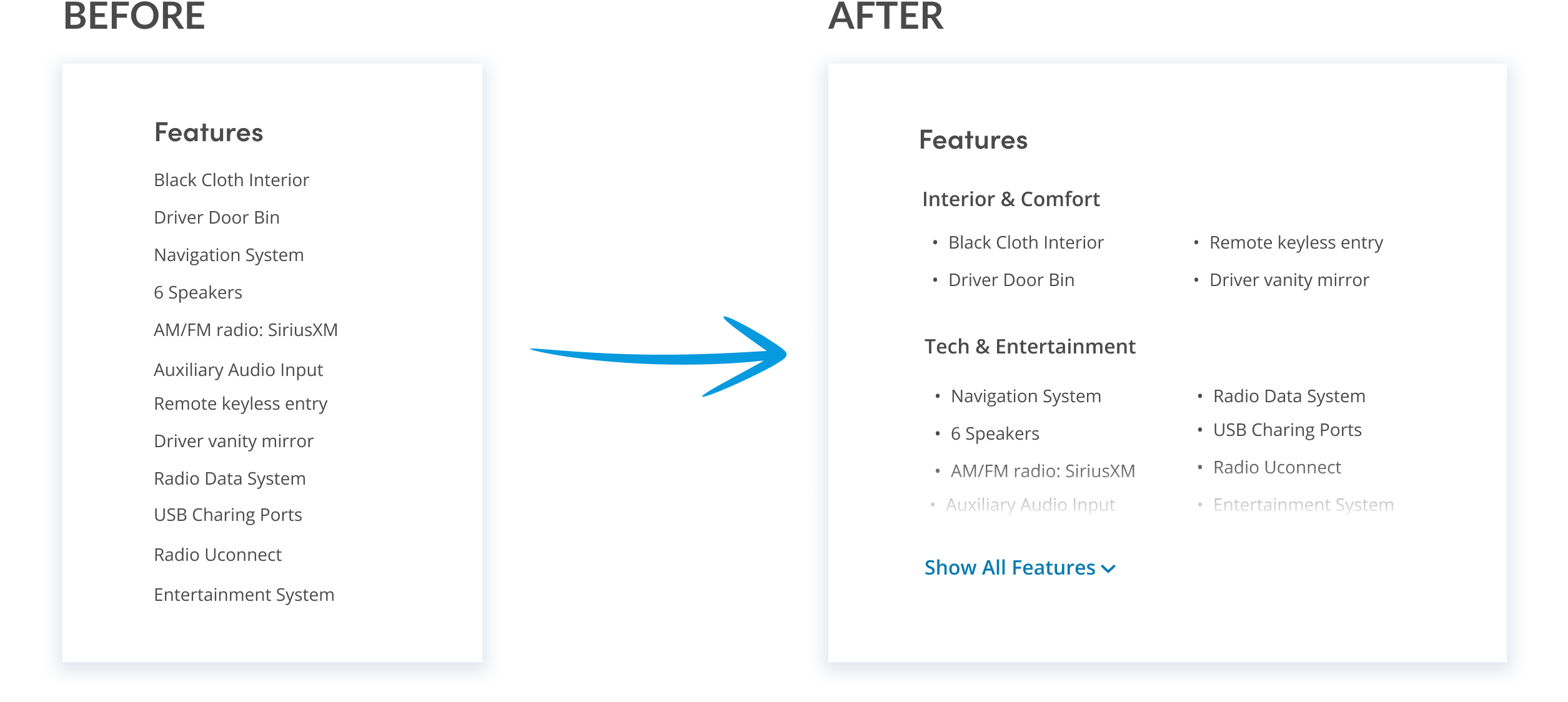
In the original features list, all items were presented in a long and unorganized list, with no grouping or categorization. This made it difficult for users to quickly scan and find the information they were looking for. Clearly the design needed improvement.
To address this, we opted for a grouped approach in the redesign. We organized the features into categories and presented them in two columns which made it easier for users to scan, and the addition of the bullet points provide enhanced readability. During testing, we discovered that some vehicles had a lot of features, which could make the list very long. To address this issue, we added a "see more" expandable link to reduce scrolling (especially on mobile). We also added a faded gradient to the last line to make it more apparent there is more content below.
/16
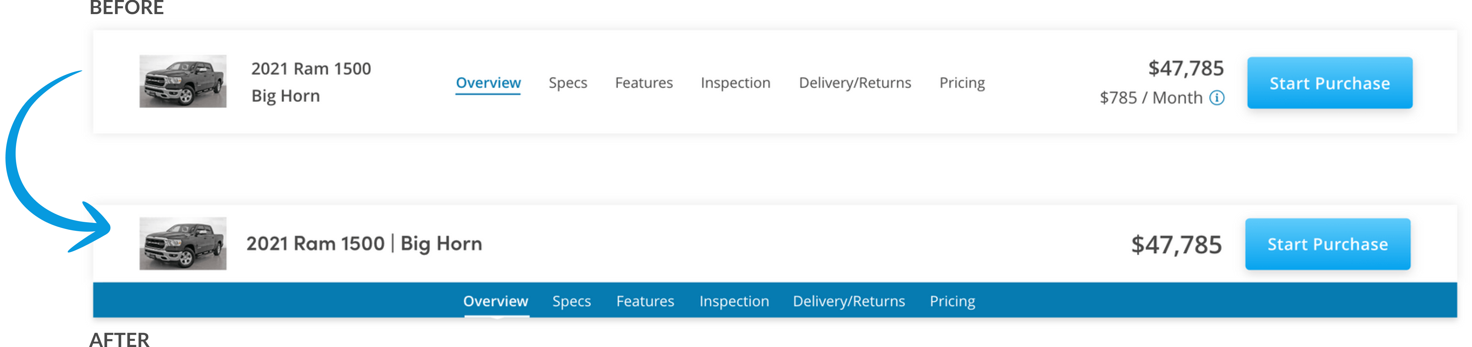
The secondary navigation bar provides quick access to specific sections on the page, improving ease of use. As the user beings to scroll down the page, the secondary nav bar slides in and replaces the regular site navigation.
Overall, users were satisfied with its functionality and found it helpful but many were not aware of its presence as it's design blended in with the regular navigation. Our solution involved modifying the layout and adding more color to increase the visual contrast which resulted in a 20% increase in interaction rates.
/17
Going back to the idea of trust, it was important to us to ensure customers we are providing maximum transparency as they browse for a car. As I mentioned earlier, customers are buying these cars without seeing it in person first so it was extremely important the customers knows exactly what they are getting.
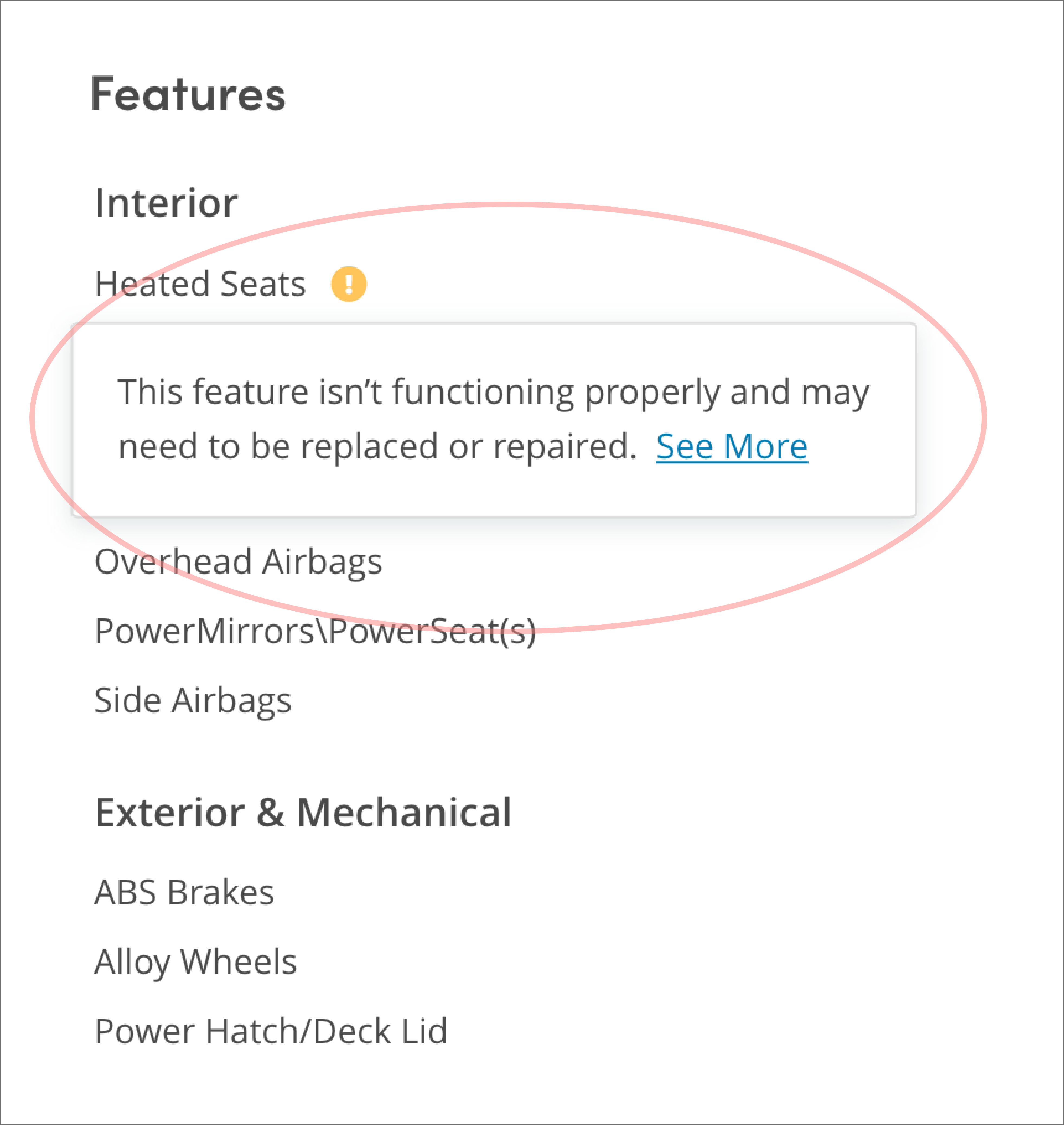
The original product page design included imperfection images (such as dents, scratches, etc) in the gallery but these were only the visual imperfections - there was no mention about broken features, etc. In the end, we implement the following solutions:
A full list of imperfections in the vehicle inspection section.
Highlight tags next to any features that may be broken or not working properly.
This enables the user to quickly jump straight to the imperfection images.
A full list imperfections in the Vehicle Inspection section.
Highlight tags next to any features that may be broken or not working properly.
This enables the user can quickly jump straight to the imperfection images.

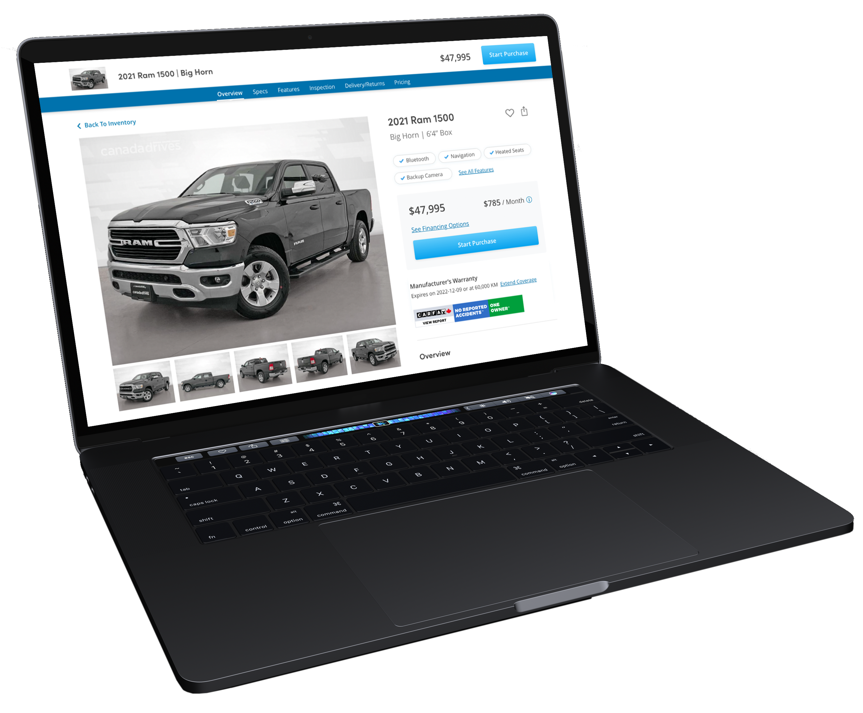
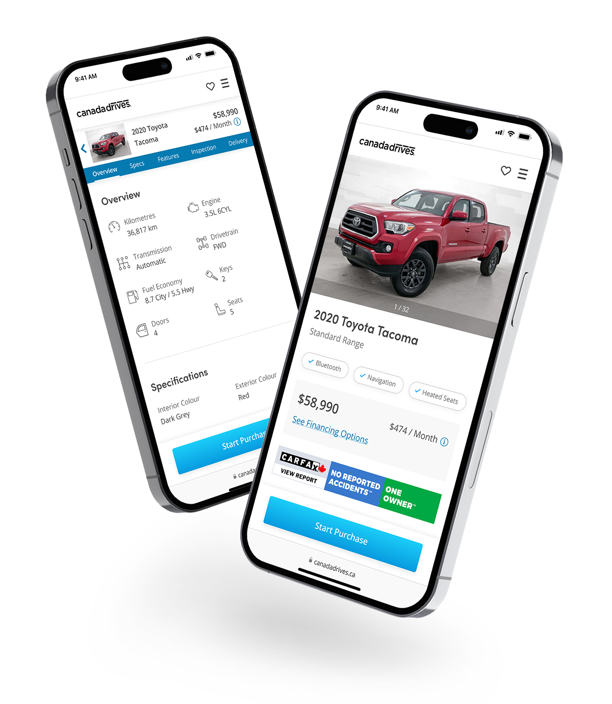
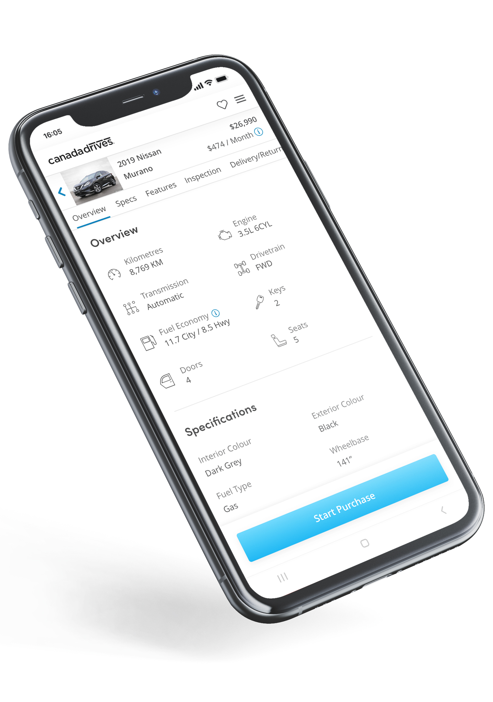
A sleek and modern design that enhances the shopping experience. With a focus on simplicity, the page is kept clutter-free to allow for a seamless shopping experience.
By prioritizing important information and displaying it in an organized manner, users can quickly find what they are looking for and make well-informed decisions.
.jpg)
With detailed and transparent product information, users can confidently make purchases and feel assured that they are getting a high quality vehicle that meets their needs.
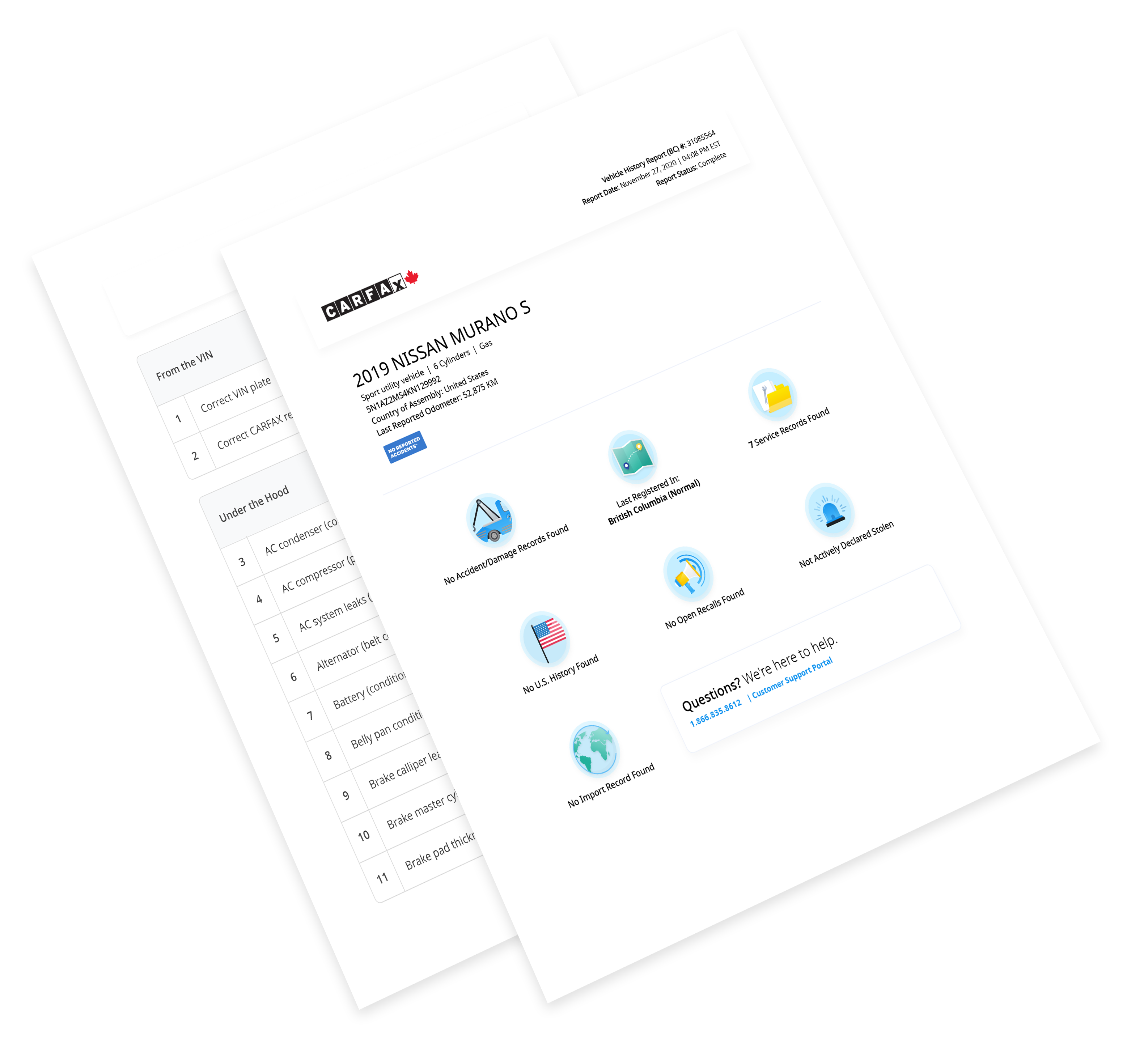
Customers can access free 150-point inspection and CARFAX reports for all vehicles, providing a comprehensive overview of each vehicle's condition and history.
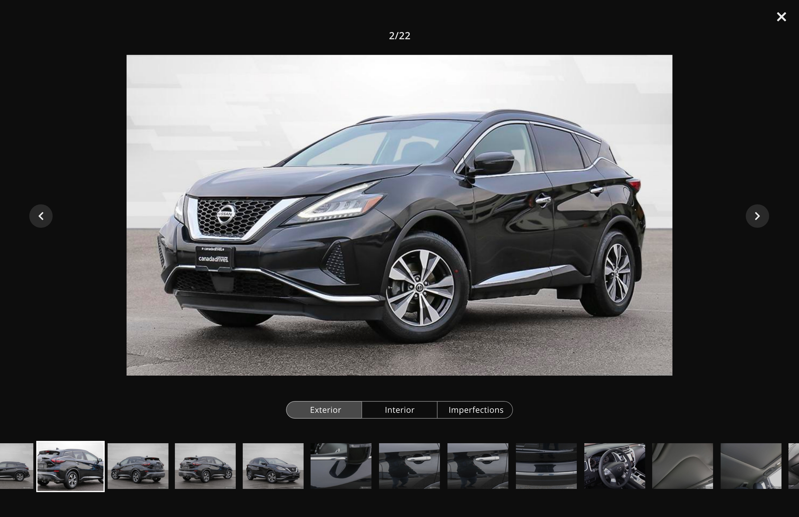
The image gallery features vehicles captured in high-resolution photos, displaying both the interior and exterior details, as well as any imperfections. Organized with a user-friendly sorting system through the use of tabs and a scrollable filmstrip-style thumbnail display, the gallery offers an easy and seamless browsing experience.
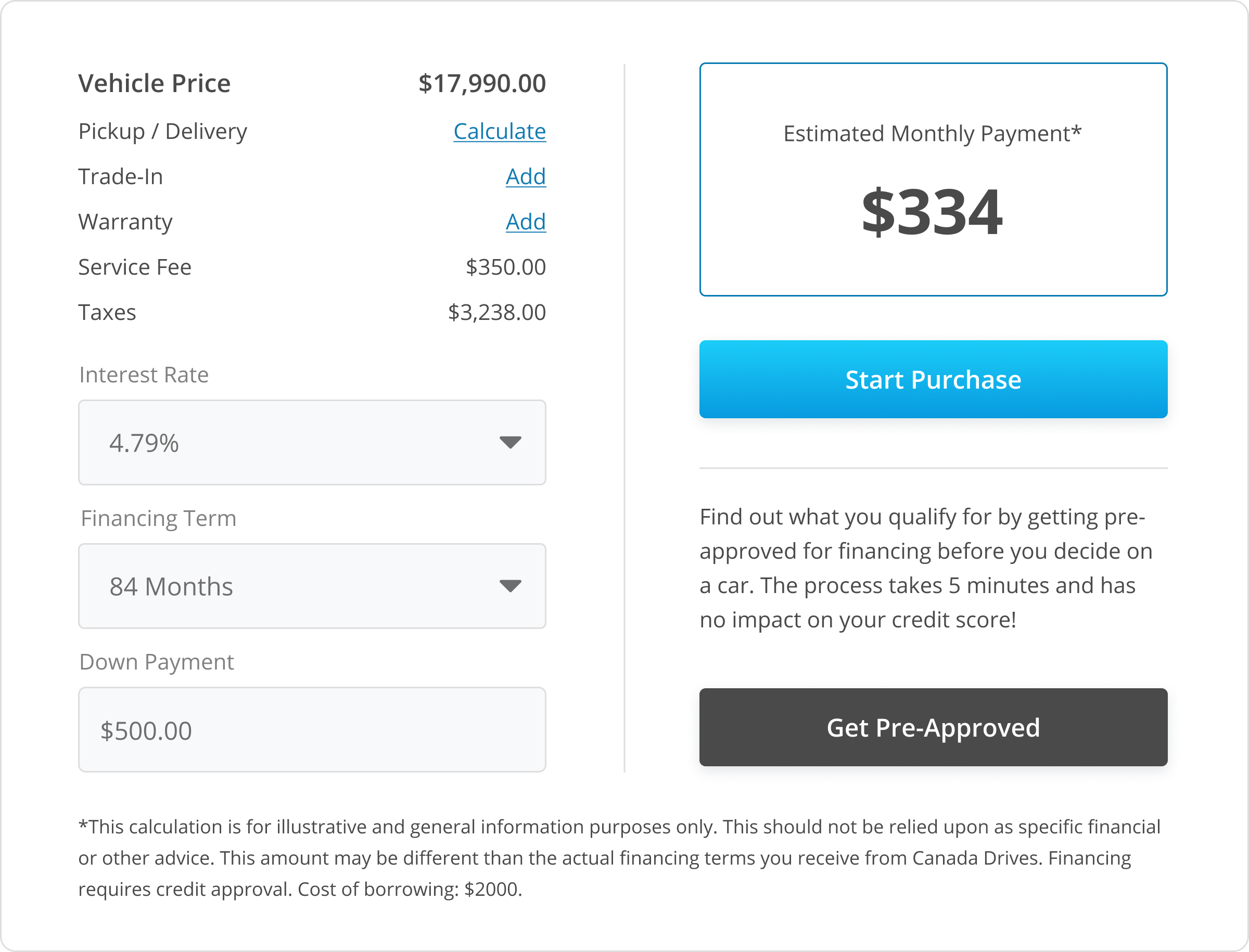
The financing calculator allows customers to calculate their monthly payments, including taxes, delivery fees, cost of warranty, trade-in value, and more. This gives customers a clear idea of the total cost before proceeding to checkout
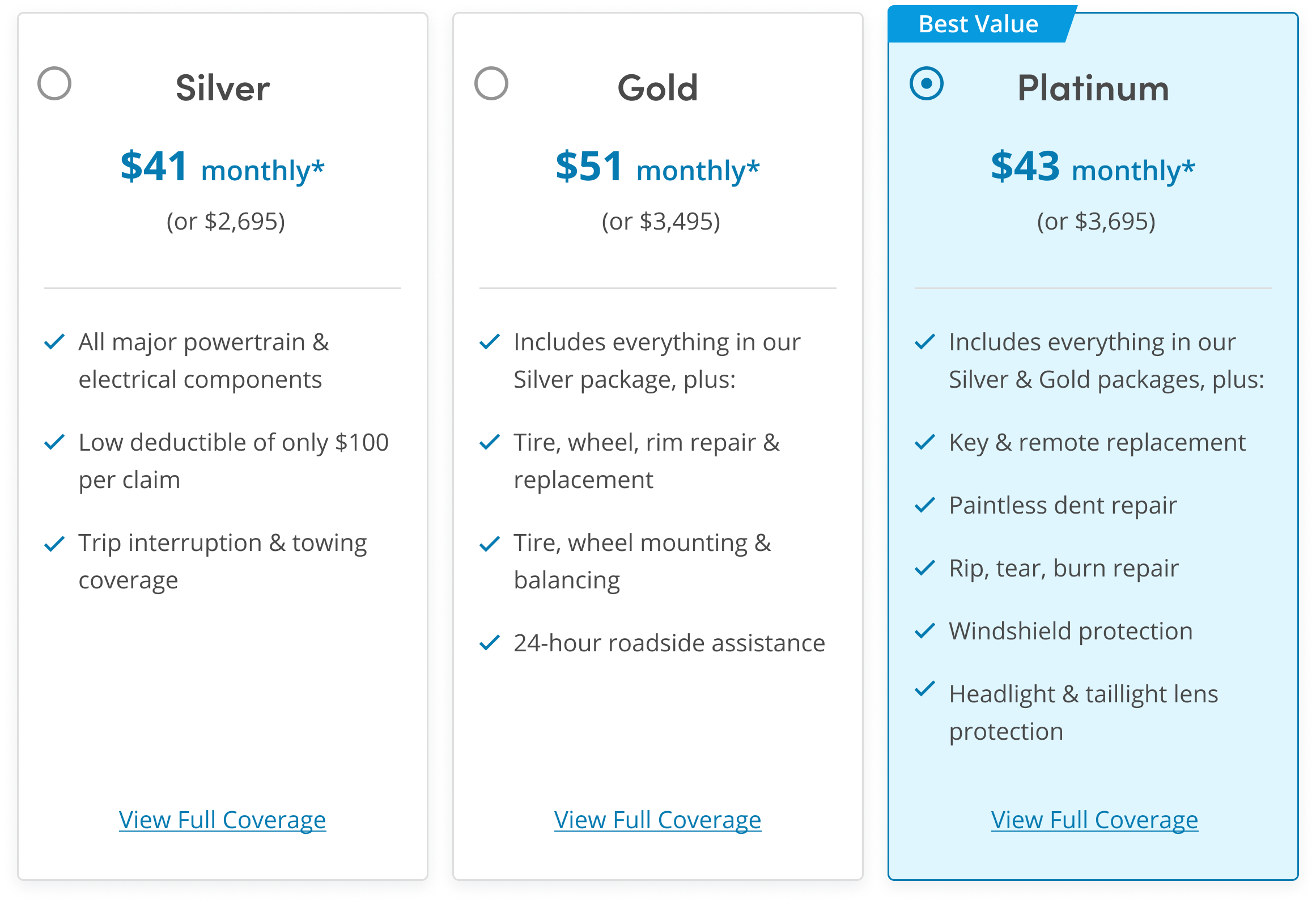
Customers can choose from three affordable extended warranty packages directly from the vehicle details page. These packages provide additional coverage and protection, ensuring customers can drive with peace of mind and feel confident in their purchase.
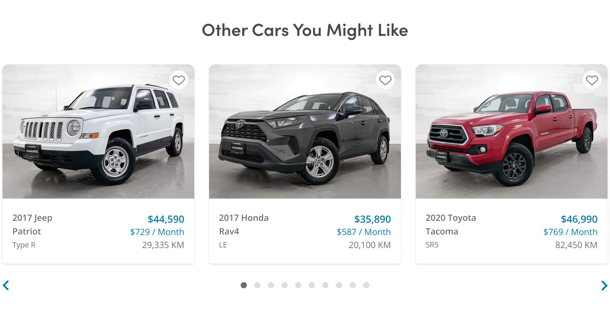
The recommended vehicle carousel offers personalized suggestions based on customers' search history, helping them quickly find the vehicles that match their preferences.
This feature makes it easier for customers to discover relevant options and save time in their search process.
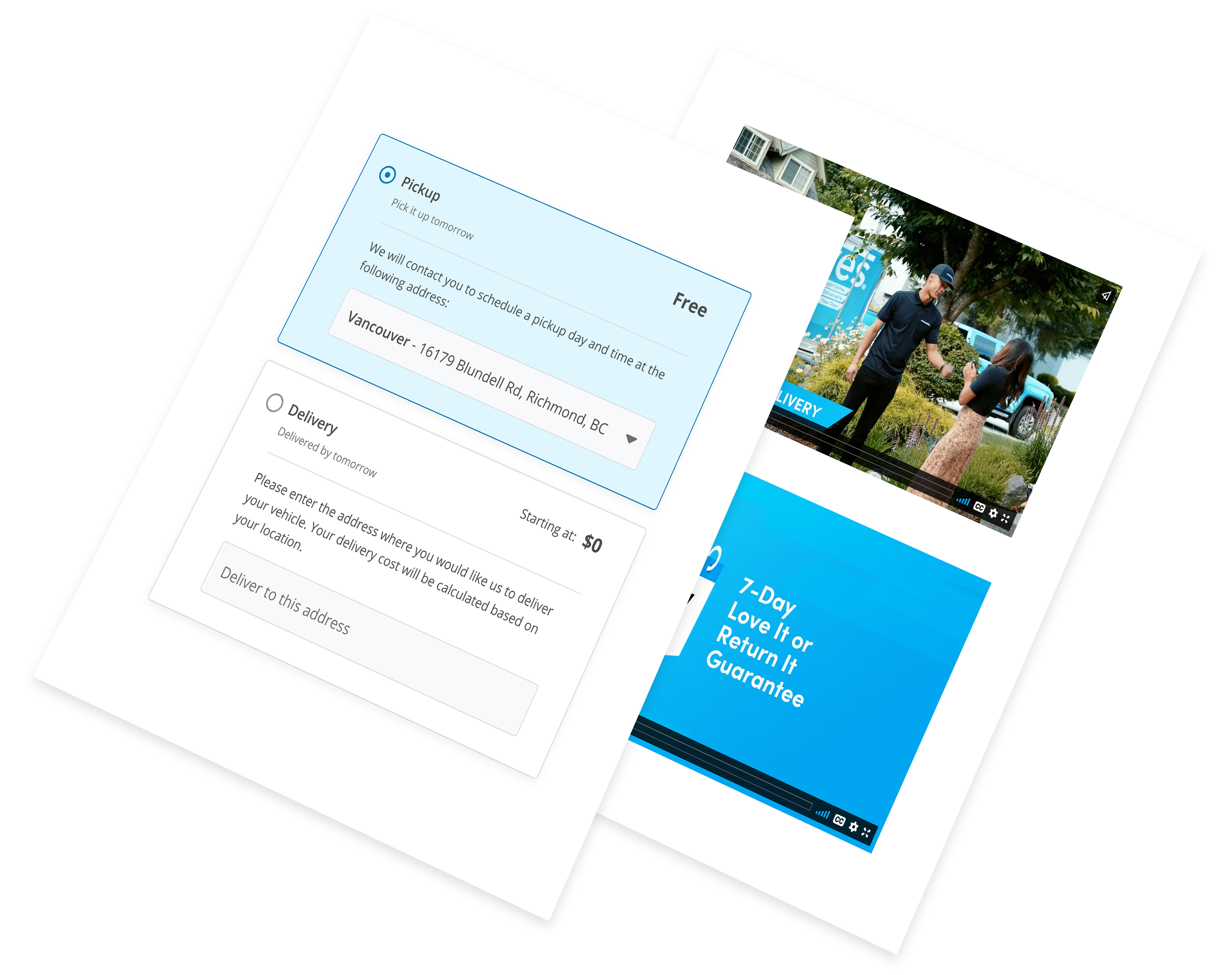
Customers can watch short, detailed videos that demonstrate the delivery and return process, providing reassurance and transparency.
Customers can choose between picking up their vehicle or having it delivered to their home, and can calculate the delivery costs directly on the vehicle page to avoid any surprises during checkout.


This project took many weeks to ideate, design, test, and implement. Although there are some steps and features that weren't mentioned in this case study, the design went through innumerable iterations and dozens of hours of user testing. There was a fair amount of caffeine consumed during this process, too. This project ended up being a huge learning experience for me and the rest of the team at Canada Drives.
The redesign went live in February 2022, which resulted in a significant increase in user engagement and a subsequent boost in conversion rates. We have since then been performing ongoing AB testing which has also proven to be effective in further improving the overall user experience on the page.
Teamwork in UX is essential. To truly succeed in design it's really important to collaborate effectively and maintain strong relationships with peers - this involves working with people who are not necessarily experts of UX and listening to their opinions and understanding their vision. Never try to come up with design solutions completely alone.

Design is more than just aesthetics; it's about understanding the needs of your users and creating solutions that meet those needs. Early conversations and extensive user testing are crucial to this process. Skipping these research phases can lead to superficial UX design that doesn't address the real issues.

Even when we believe our work is the best it can be, we should still be open to constructive feedback because the reality is that there is always room for improvement. Being willing to listen and adapt leads to better outcomes and ensures that our designs stay relevant and effective.