

My Role
UI Design
Year
2023
Duration
6 Months
Without a design system, UI patterns become inconsistent, delivery slows, and teams rely on scattered sources of truth. Questrade’s products had grown this way over time, resulting in duplicated work and unnecessary extra effort during the design process.
Allspark Design System was built to increase efficiency and give designers and developers a single source of truth. My role was applying the system across Questrade’s platform, bringing consistency across multiple lines of business, reducing UI debt, and improving cross-team alignment.

We used the Atomic Design methodology as our foundation (atoms → molecules → organisms). It gave the team a shared model for breaking down complex interfaces into reusable parts, ensuring consistency at every level. This structure improved collaboration between design and engineering, accelerated component development, and made the UI more scalable as the platform grows.

/04
User personas were chosen to foster a deeper understanding of our target audience, their goals, and behaviors, guiding our decision-making process. These personas allowed us to empathize with users, gain valuable insights into their needs, and make informed design and development choices tailored to their specific requirements. By incorporating user personas, we ensured a user-centered approach that resulted in a more targeted and effective product.

Age: 25
Work: Web Developer
Family: Single
Joshua is a first time car buyer. He values transparency and expects to find all the information he needs to make an informed decision on the website. He is a busy individuals with a fast-paced lifestyle, and wants to be able to quickly and easily find the information he needs without having to spend a lot of time searching for hidden information.
• User-friendly platform with transparent info on car buying process
• To be able to see detailed vehicle specs, pricing, financing
• First time car-buyer, unfamiliar with car buying processes
• Frustration with websites that have unclear or incomplete information

Age: 36
Work: Photographer
Family: Married, 2 children
Emily appreciates being able to see detailed images of the vehicles she is interested in. She values clear and concise language and is easily confused by industry jargon and technical terms. She has a busy lifestyle and prefers the convenience of online shopping over visiting physical dealerships.
• Wants to see high-quality images and visual content
• Prefers simple language to explain vehicle details
• Feeling overwhelmed or confused by technical terms
• Frustration with the inconvenience of visiting physical dealerships
Typography, colors, spacing, and iconography form the visual foundation of the system.

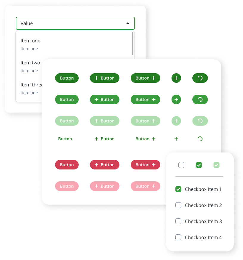
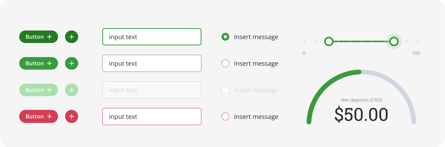
Molecules combine atoms into small reusable UI elements such as buttons, inputs, and selection controls.
Organisms combine molecules into larger reusable modules, forming structured interface blocks such as tables, forms, and cards.
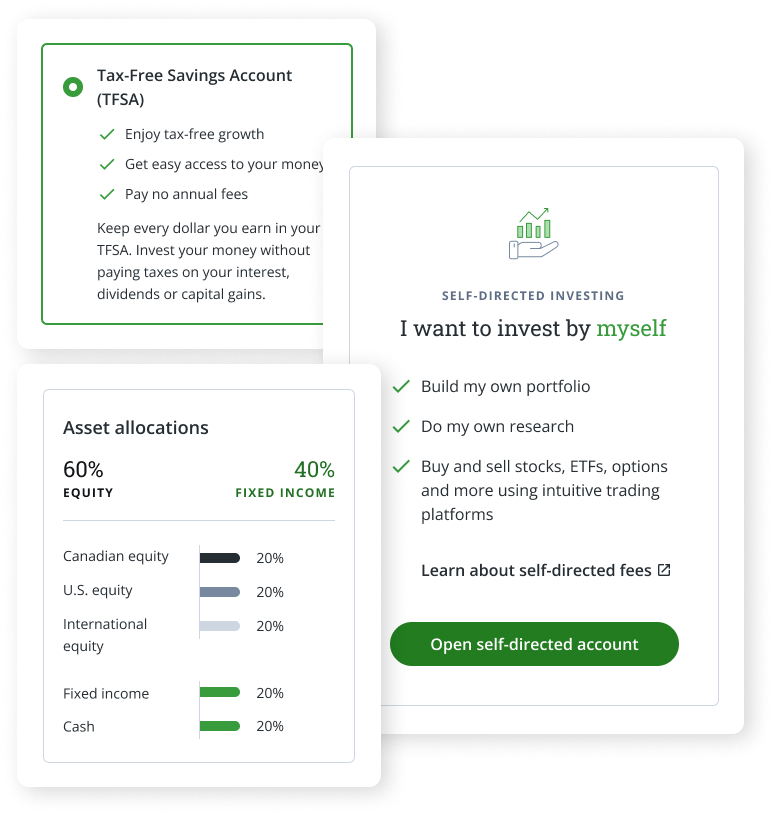
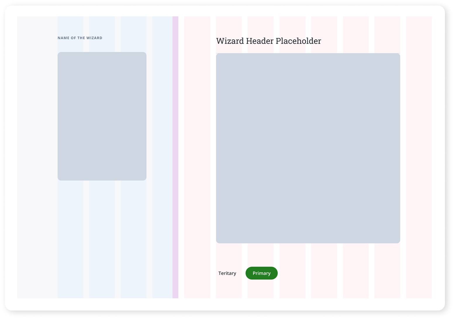
These are reusable layouts that define structure for complex flows. They keep interactions consistent and give teams a predictable starting point for building new pages.

Complete layouts assembled from system components, delivering consistent and intuitive experiences across the platform.
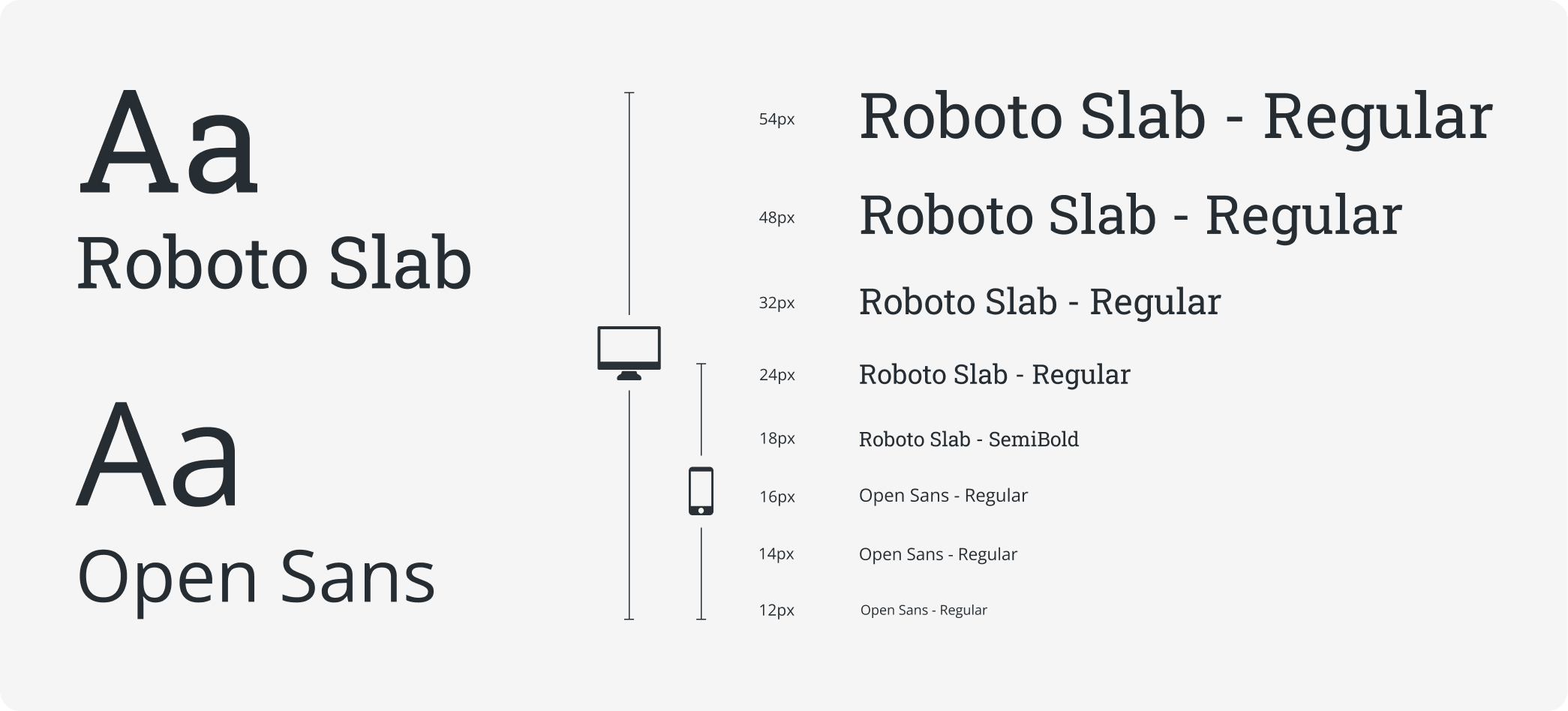
Roboto Slab and Open Sans create a clean, dependable typographic system suited for high-density financial data. Roboto Slab gives headlines a confident, authoritative feel, while Open Sans delivers consistent readability at smaller sizes. The pairing maintains visual clarity from desktop layouts to compressed mobile views, supporting fast scanning, clear hierarchy, and an efficient trading experience.
This color palette is designed to create a clear visual hierarchy across the product while supporting accessibility, consistent communication, and brand expression. Colors are grouped into functional categories so designers can quickly select the appropriate tone for each UI state, message type, or interaction pattern.

Questrade’s components share a simple, flat visual style with soft rounding that keeps the interface approachable. Consistent spacing and typography make every button, field, and dropdown easy to read and interact with. The minimalism fits finance, where clarity is more valuable than decorative visuals. In short, the component system is clean, scalable, and easy to apply across the product.
Every component includes clear documentation on usage, states, spacing, and interaction rules. This removes ambiguity and ensures designers and developers apply patterns consistently. Teams save time because there is no debate or guessing.
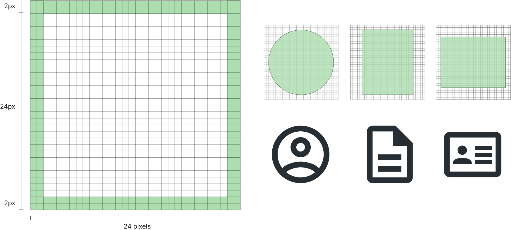
This icon system is built on a standardized 24×24 pixel grid with a 2-pixel safe zone to maintain consistent sizing, stroke weight, and visual balance. The unified structure keeps the set cohesive, easier to implement, and highly legible across dense interfaces.
These icons communicate ideas, not UI actions, so they needed to feel expressive without adding visual noise. Each Spot Icon follows a consistent 2px stroke to maintain clarity at small sizes. The simplified geometry allows them to scale cleanly at 56×56 and 80×80 without distortion. Their visual language was tailored to match the Allspark aesthetic, ensuring cohesion alongside system icons, illustrations, and typography.

/04
User personas were chosen to foster a deeper understanding of our target audience, their goals, and behaviors, guiding our decision-making process. These personas allowed us to empathize with users, gain valuable insights into their needs, and make informed design and development choices tailored to their specific requirements. By incorporating user personas, we ensured a user-centered approach that resulted in a more targeted and effective product.
Age: 25
Work: Web Developer
Family: Single
Joshua is a first time car buyer. He values transparency and expects to find all the information he needs to make an informed decision on the website. He is a busy individuals with a fast-paced lifestyle, and wants to be able to quickly and easily find the information he needs without having to spend a lot of time searching for hidden information.
• User-friendly platform with transparent info on car buying process
• To be able to see detailed vehicle specs, pricing, financing
• First time car-buyer, unfamiliar with car buying processes
• Frustration with websites that have unclear or incomplete information
Age: 36
Work: Photographer
Family: Married, 2 children
Emily appreciates being able to see detailed images of the vehicles she is interested in. She values clear and concise language and is easily confused by industry jargon and technical terms. She has a busy lifestyle and prefers the convenience of online shopping over visiting physical dealerships.
• Wants to see high-quality images and visual content
• Prefers simple language to explain vehicle details
• Feeling overwhelmed or confused by technical terms
• Frustration with the inconvenience of visiting physical dealerships
These icons support functional clarity, appearing in navigation, toolbars, action menus, tables, and status indicators. Because they’re built as standardized system components, they integrate cleanly into buttons, selection lists, and widgets, reducing ambiguity and improving scanability in dense trading interfaces.


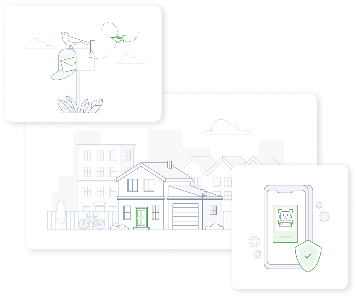
We created a full library of over 75 custom spot illustrations to support key product moments. The visual style uses soft geometry, light detail, and a restrained green accent to avoid visual heaviness. Each piece was built to feel consistent with the broader Allspark aesthetic, balancing clarity with personality.
These larger custom illustrations bring conceptual clarity to key screens, helping users understand context without relying solely on text. They follow the same visual rules as the Spot Icons (consistent 2px stroke, restrained color palette, and balanced spacing) which keeps them lightweight and cohesive across the experience. They support storytelling, help reduce cognitive load, and add visual breathing room to dense financial workflows.
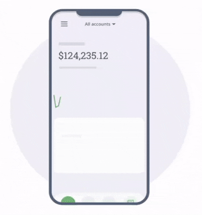
Animations are used to direct attention and improve clarity, like this example which visually guides users to where they can find their tax slips. Others are used to make the interface feel more responsive and less static, adding a sense of refinement to the overall experience. Motion is used sparingly and always with purpose.
We worked closely with development to align on component structure, naming, accessibility, and token usage. Internal feedback and A/B testing informed which patterns were effective. This guided refinement of layouts, components, and content hierarchy to improve clarity and consistency.

The new design system reduced UI debt by roughly 30 percent across the customer portal. Standardizing visual rules and reusable patterns meant less one-off work and fewer inconsistencies sneaking into production. Teams now had a shared foundation to build from rather than reinventing UI each time. Over time this also reduced maintenance effort, preventing fragmented code and ad-hoc design fixes from piling up.

Reusable components cut down repetitive work and improved delivery speed. Instead of rebuilding similar UI from scratch, designers could plug in verified patterns and focus on solving actual problems. Page creation cycles shrank dramatically for recurring layouts like identity verification, deposits, document access, and settings. This freed up both design and engineering time to focus on higher-value improvements rather than patching UI.
We faced challenges shifting stakeholders away from a screen-by-screen mindset and investing upfront in tokens and components before the payoff was visible. Managing legacy UI alongside new standards also required careful coordination. The Atomic Design approach gave both design and engineering a shared structure for scaling work.
Going forward, we plan to continue improving alignment between design and development, and continue evolving components based on real usage and usability feedback.


